Collection Page – Crafton
The Collection Page in Crafton is designed to help customers browse products in a visually appealing and easy-to-navigate layout.
With flexible design options and built-in filtering and sorting, it’s perfect for showcasing product categories of any size.
It combines a bold Collection Banner with a highly customizable Product Grid, making it ideal for showcasing product categories of any size.
Features of Crafton’s Collection Page:
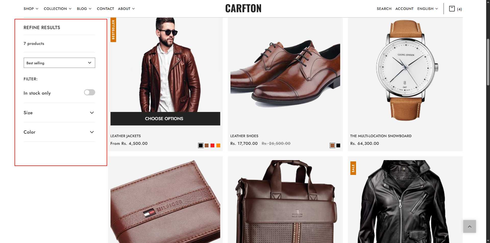
- Collection Banner: Add an eye-catching banner with a title and description to introduce the collection.
- Collection Product Grid: Display your products in a flexible grid with adjustable rows and columns.
- Built-in sorting & filtering options for easy navigation.
- Quick Add to Cart and Hover Effects to streamline shopping.
- Fully customizable layout, spacing, and styles.
- Fully optimized layout for mobile screens.
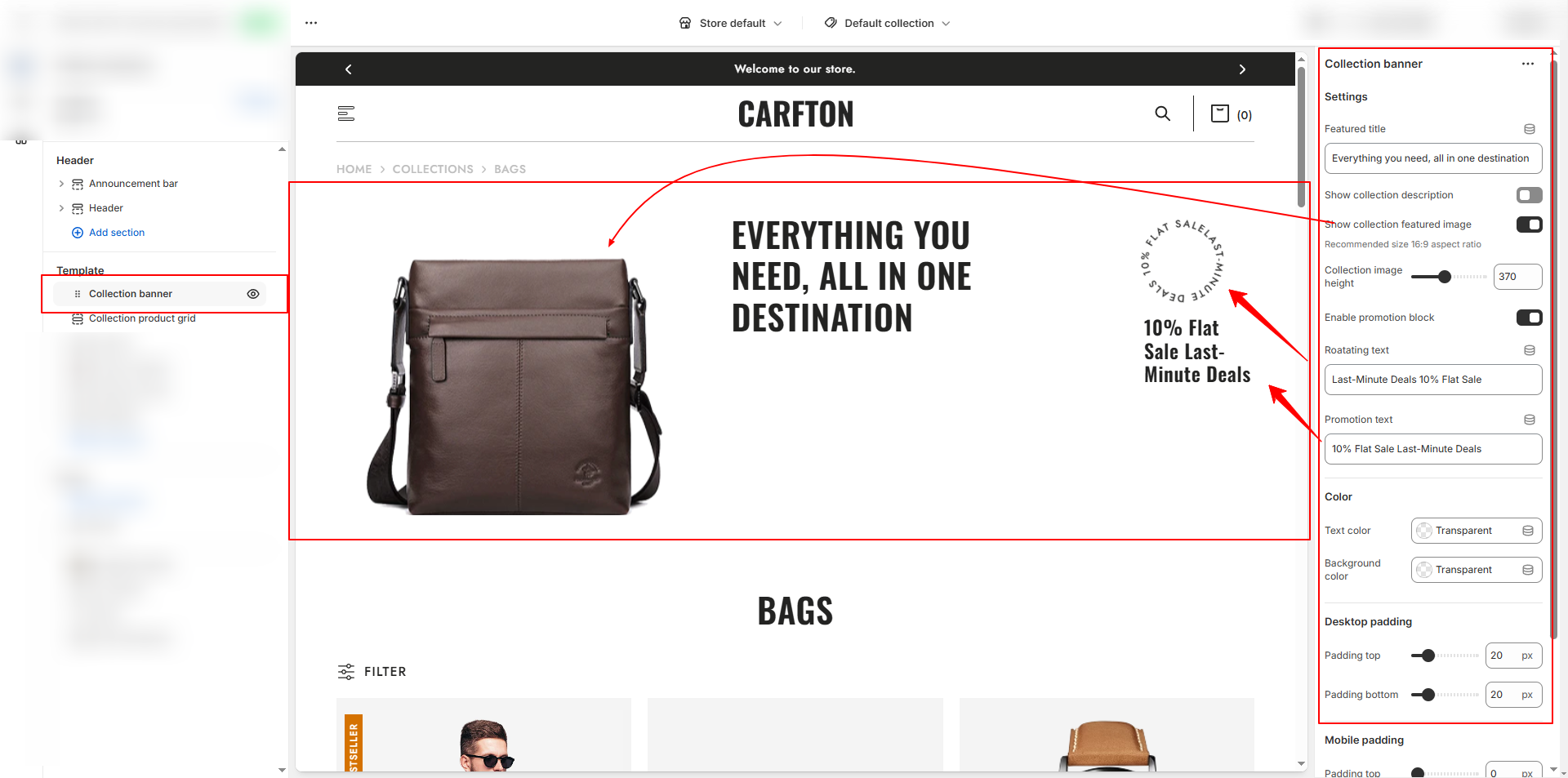
Collection Banner Settings:
The Collection Banner is displayed at the top of the collection page to give context and branding.
- Banner Image: Upload a high-quality banner image.
- Collection Title: Enable or disable the display of the collection name.
- Description: Add a short paragraph about the collection (optional).
- Height Settings: Adjust the height of the banner for different devices.
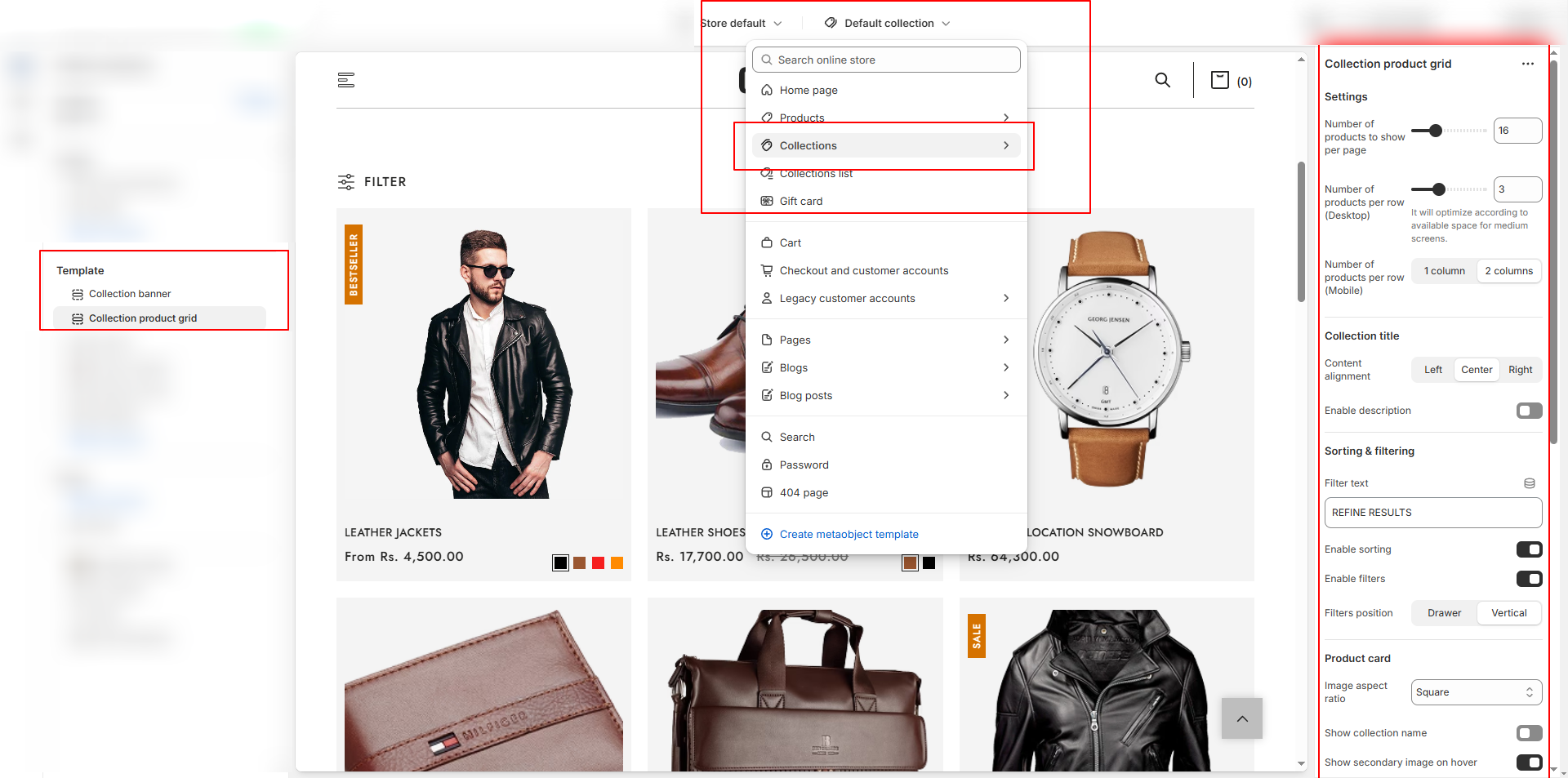
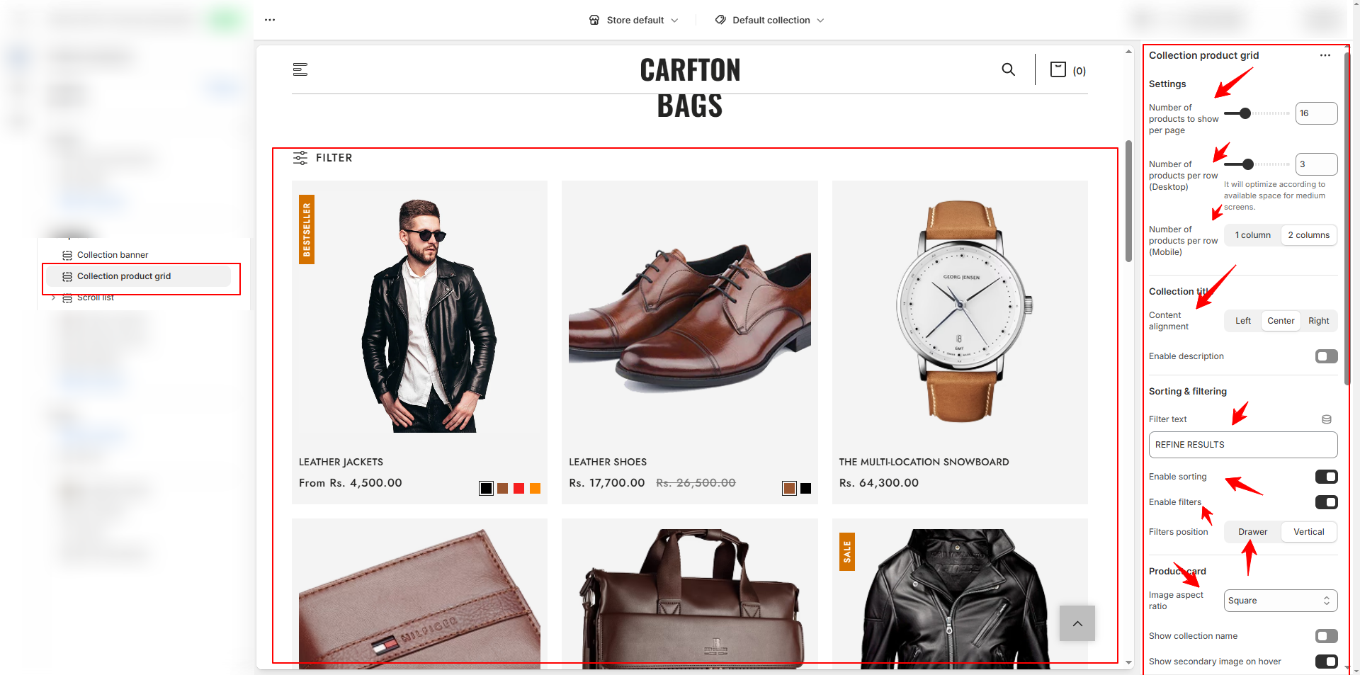
Collection Product Grid Settings
The Collection Product Grid lets you control how products are displayed within the collection.
-
Grid Layout:
- Number of Products per Page: Set the total number of products visible before pagination or infinite scroll.
- Number of Products per Row (Desktop): Choose 2, 3, or 4 columns.
- Number of Products per Row (Mobile): Select 1 or 2 columns for smaller screens. -
Title & Description:
- Content Alignment: Position collection titles left, center, or right.
- Number of Products per Row (Desktop): Choose 2, 3, or 4 columns.
- Enable Description: Toggle to show or hide the collection description. -
Sorting & Filtering:
- Enable Sorting: Allow customers to sort by Best Selling, Price: Low to High, Newest, etc.
- Enable Filters: Turn on Shopify’s native filtering system for tags, price, availability, etc. -
Filter Position:
- Drawer: Opens filters in a side drawer (best for mobile).
- Vertical: Displays filters in a sidebar (best for desktop).
- Filter Label Text: Customize the label (e.g., Refine Results). -
Product Card Options:
- Image Aspect Ratio: Choose Square, Portrait, or Adapt to Image.
- Show Collection Name: Display the collection name above product titles (optional).
- Show Secondary Image on Hover: Enable alternate product image for hover effects.
How to Customize the Collectin Page:
- Go to Online Store → Themes → Customize.
- From the top page dropdown, select Collections → Default Collection.
- Add or remove blocks as needed.
- Edit the Collection Banner and Collection Product Grid blocks to adjust settings and content.
- Save your changes.