Before After Slider Section – Nexus
The Before–After Slider section in Nexus is designed to showcase real, visible transformations through an interactive image comparison experience.
By allowing customers to drag and reveal results instantly, this section builds trust, increases engagement, and clearly communicates product effectiveness—making it a must-have for beauty and skincare brands.
Features of the Before After Slider Section :
- Interactive transformation reveal that lets users compare results with a smooth drag motion.
- Story-driven layout combining images with headings, descriptions, and a call-to-action.
- Multiple comparison sets supported to highlight different products or use cases.
- Fully customizable design to match your brand’s colors, typography, and layout.
- Mobile-optimized and touch-friendly for seamless interaction on all devices.
How to Set Up the Before After Slider Section :
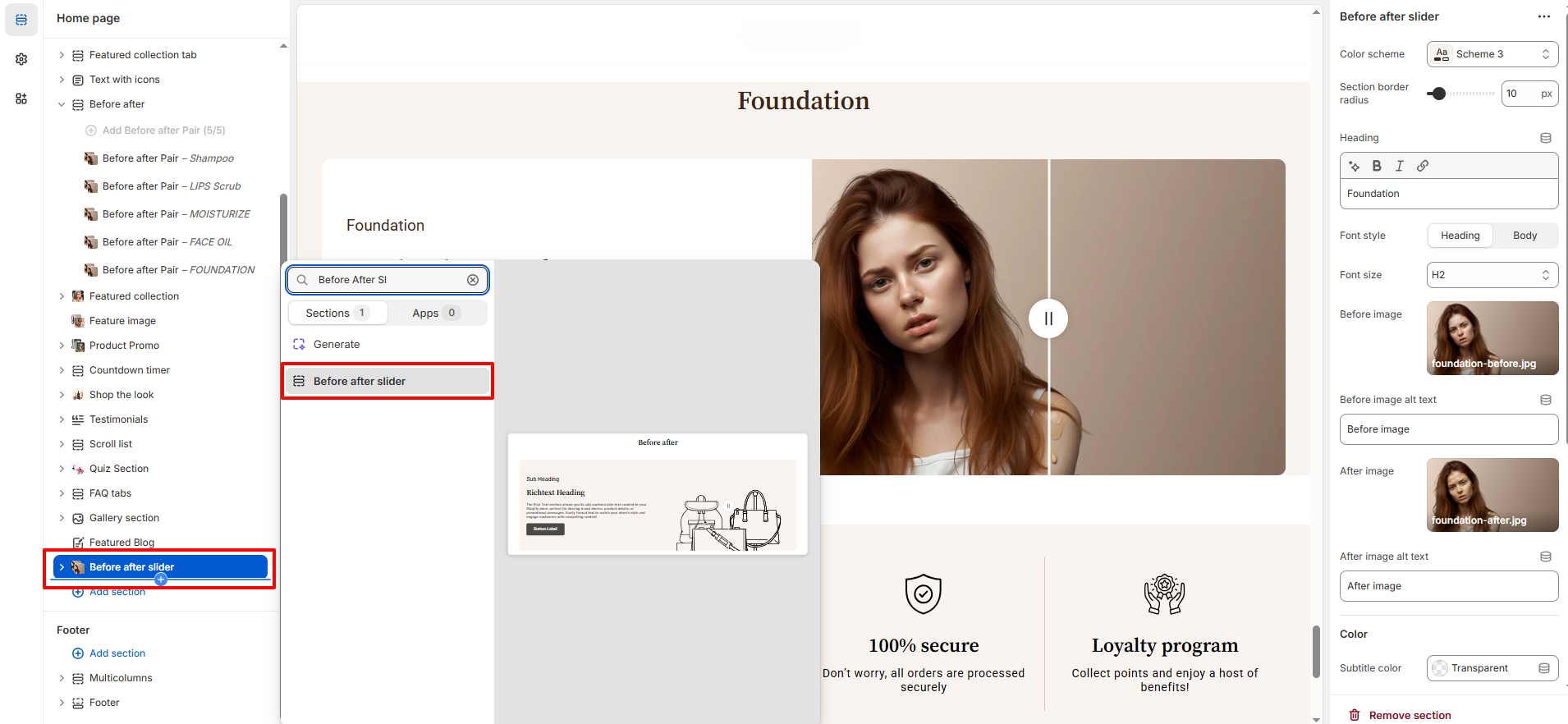
- Go to Online Store → Themes → Customize.
- Click Add section and select Before After Slider from the section list.
- In the settings panel, configure the following.
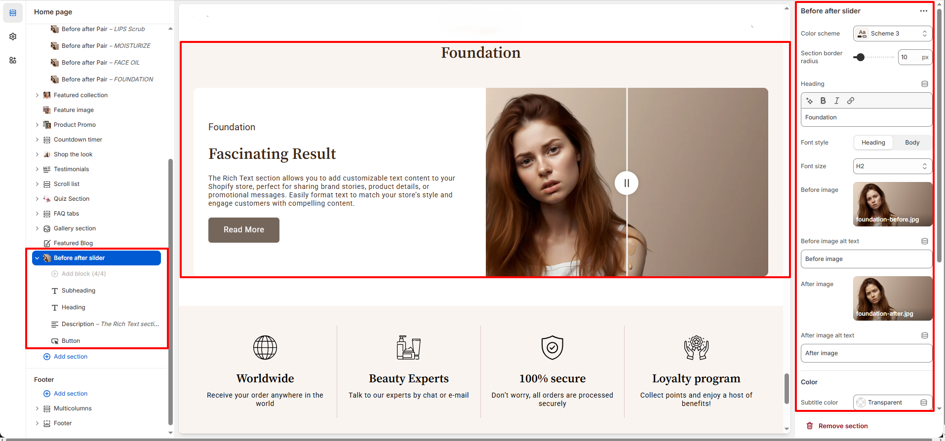
Before After Slider Settings :
- Color Scheme : Choose a predefined color scheme to match your store’s branding.
- Section Border Radius : Adjust the corner radius of the slider container for a softer or sharper visual look.
- Heading : Add the main title for the before–after comparison.
- Font Style : Choose whether the heading uses a heading or body font style.
- Font Style : Choose whether the heading uses a heading or body font style.
- Font Size : Control the heading size (H1–H6) for visual hierarchy.
- Before Image : Upload the image representing the “before” result.
- Before Image Alt Text : Add descriptive alt text for accessibility and SEO.
- After Image : Upload the image representing the “after” result.
- After Image Alt Text : Add descriptive alt text for accessibility and SEO.
- Subtitle Color : Set the color of the subtitle text.
- Text Color : Control the main text color inside the section.
- Background Color : Choose a background color or keep it transparent.
-
Spacing :
- Desktop Spacing : Adjust the Top-Bottom Spacing in Desktop screen
- Mobile Spacing : Adjust the Top-Bottom Spacing in Mobile screen
Before After Slider Blocks
-
Subheading Block Settings :
- Subheading Text : Add a short label or category name to introduce the before–after comparison (e.g., Foundation, Skincare, Hair Care).
- Font Style : Choose between Heading or Body font style to control visual emphasis.
- Font Size : Select the subheading size (from extra small upwards) for subtle or prominent display.
- Color : Set a custom color for the subheading text to match your brand or section design.
-
Heading Block Settings :
- Heading Text : Add the main title that highlights the transformation or result (e.g., Fascinating Result).
- Font Style : Choose between Heading or Body font style depending on the visual hierarchy you want.
- Font Size : Select the heading size (H1–H6) to control prominence within the section.
-
Description Block Settings :
- Description Text : Add supporting content to explain the transformation, product benefits, or key details shown in the before–after images.
-
Button Block Settings :
- Button Label : Enter the text displayed on the button (e.g., Read More, Shop Now).
- Button Link : Paste a URL or search your store to link the button to a product, collection, or page.
- Open Link in New Tab : Enable this option to open the link in a new browser tab when clicked.
- Button Style : Choose the button’s appearance to match your store’s design and branding.(Primary,Secondary,link)
Pro Tips :
Use high-quality, consistent lighting and angles for your before and after images to
create a believable transformation.
Pair headings and descriptions with benefit-focused text to maximize clarity and
engagement.
Use clear calls-to-action to guide visitors from visual proof to product pages.