Collection Page – Nexus
The Collection Page in Nexus is thoughtfully designed to showcase beauty products in a clean, elegant, and easy-to-navigate layout. It helps customers effortlessly explore makeup, skincare, and beauty collections while maintaining a premium visual experience.
With flexible layout controls and built-in filtering and sorting options, the Nexus Collection Page is ideal for displaying beauty product categories of any size—from small curated collections to large product catalogs.
It combines a visually rich Collection Header with a highly customizable Product Grid, making it perfect for presenting beauty products in an organized and engaging way.
Features of Nexus Collection Page :
- Collection Header : Add a stylish collection header with a title and optional description to introduce the beauty category and set the tone for the collection.
- Customizable Product Grid : Display products in a flexible grid with adjustable number of products per row and per page, allowing you to control how dense or spacious the layout appears.
- Built-in Filtering & Sorting : Enable sorting options (such as best selling or price) and filters to help customers quickly find the beauty products they’re looking for.
- Quick Add to Cart and Hover Effects to streamline shopping.
- Product Cards with Beauty-Focused Details : Show product images, prices, sale badges, sold-out labels, and optional variant previews to highlight key product information at a glance.
- Quick View & Product Options : Allow customers to preview product details or variants directly from the collection page for a smoother shopping experience.
- Responsive & Mobile-Optimized : Fully optimized for mobile devices, with adjustable column layouts to ensure a seamless browsing experience across all screen sizes.
- Flexible Spacing & Styling Controls : Customize padding, alignment, color schemes, and image ratios to match your brand’s beauty aesthetic.
Collection Header Settings :
The Collection Header introduces each beauty category with a clean, elegant design that highlights the collection name.
- Color Scheme : Choose a color scheme to control the background and text colors of the collection header, ensuring it matches your beauty brand identity.
- Banner Image : Upload a high-quality banner image to visually represent the collection. Beauty-focused lifestyle or product imagery works best for a premium look.
-
Image Aspect Ratio :
- Adapt to Image : Automatically adjusts the banner height based on the uploaded
- Fixed : Keeps a consistent banner height across all collections.
- Show Description : Enable this option to display the collection description below the title. This is ideal for adding a short introduction or highlighting key beauty benefits.
- Heading Alignment : Align the collection title and description to the Left, Center, or Right to match your design preference.
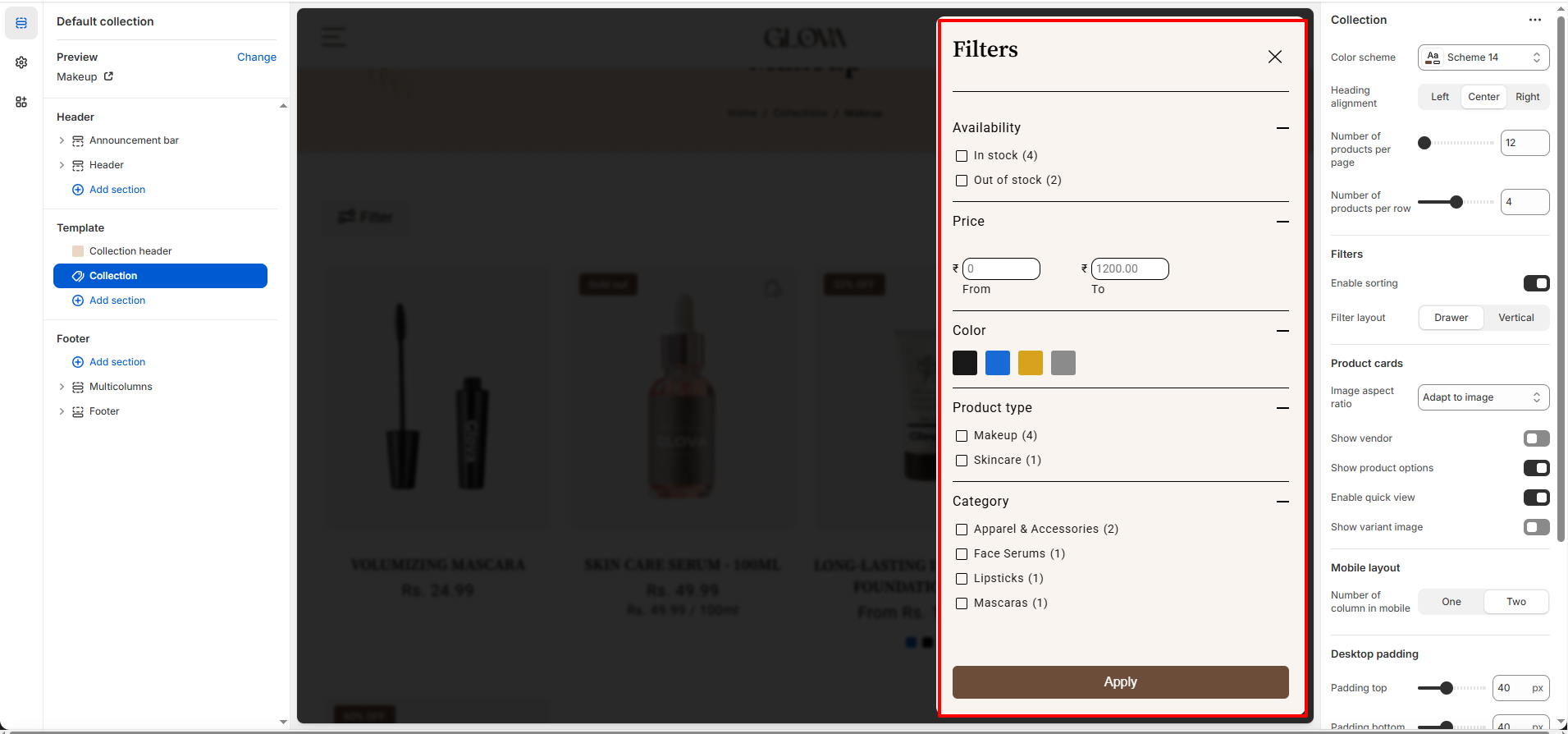
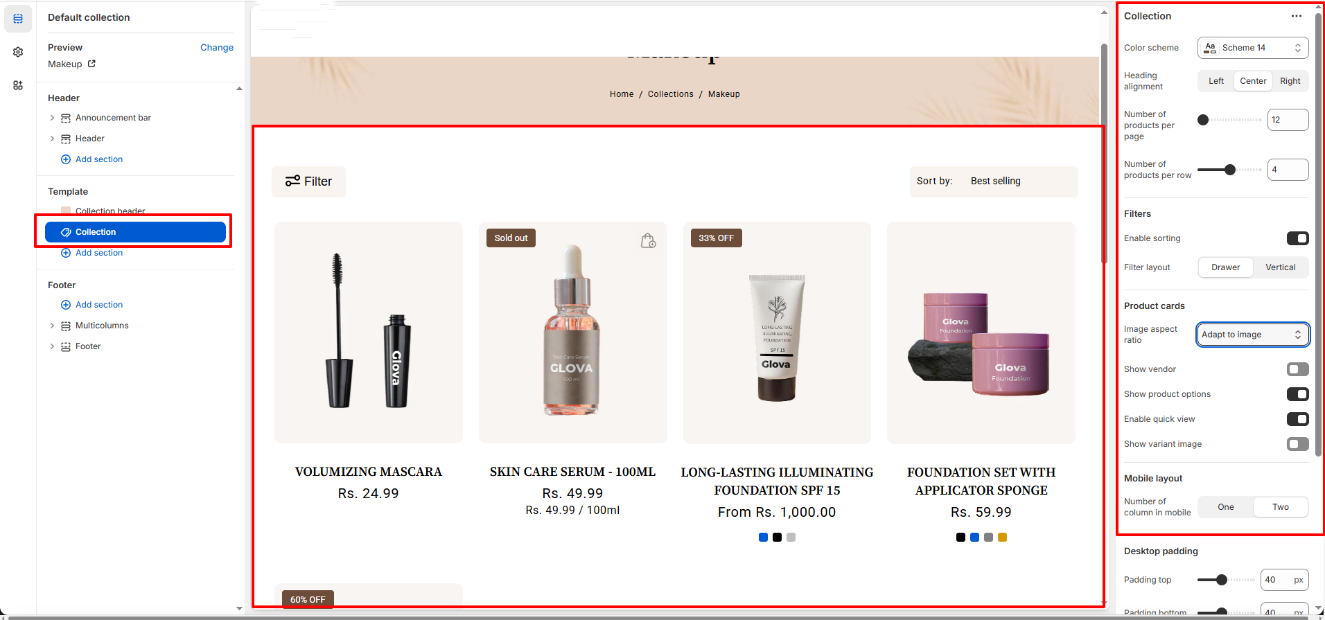
Collection Settings
The Collection Product Grid lets you control how products are displayed within the collection.
-
General :
- Color Scheme : Select a predefined color scheme to style the collection page background, text, and UI elements.
- Heading Alignment : Choose how the collection title is aligned.(Options : Left, Center, Right)
-
Grid Layout :
- Number of Products per Page : Set the total number of products displayed on a collection page before pagination is applied.
- Number of Products per Row (Desktop) : Control how many products appear in a single row on desktop devices.
-
Filtering :
- Enable Sorting : Allow customers to sort products using Shopify’s default sorting options
- Filter Layout : Choose how filters are displayed on the collection page :
- Drawer – Filters open in a slide-out panel (recommended for mobile).
- Vertical – Filters appear in a sidebar layout (recommended for desktop).
-
Product Cards :
- Image Aspect Ratio : Control how product images are displayed within the grid.(Adapt to Image,Square,Landscape,Portrait)
- Show Vendor : Toggle to display or hide the product vendor name on product cards.
- Show Product Options : Enable product variant options (such as size or shade) directly on the product card.
- Enable Quick View : Allow customers to preview product details in a popup without leaving the collection page.
- Show Variant Image : Automatically update the product image when a variant is selected.
-
Mobile Layout :
- Number of Columns on Mobile : Choose how many products appear per row on mobile devices.(One or Two columns).
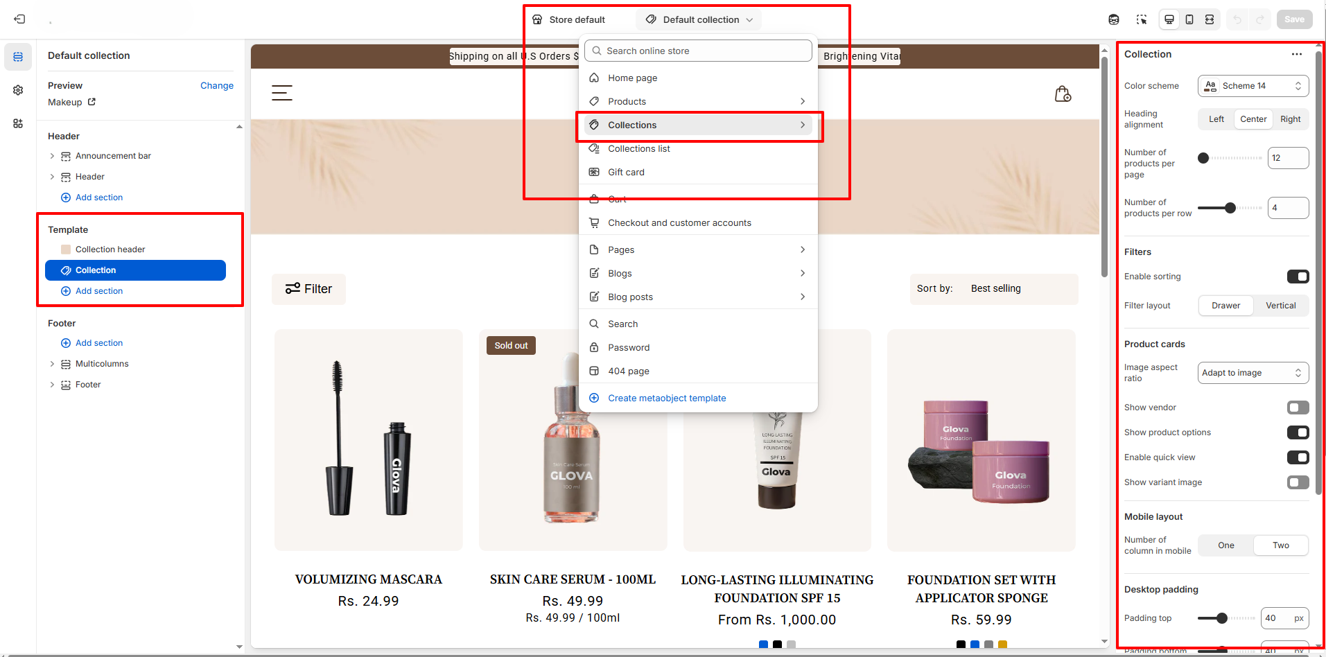
How to Customize the Collection Page :
- Go to Online Store → Themes → Customize.
- From the top page dropdown, select Collections → Default Collection.
- Add or remove blocks as needed.
- Edit the Collection Header and Collection blocks to adjust settings and content.
- Save your changes.