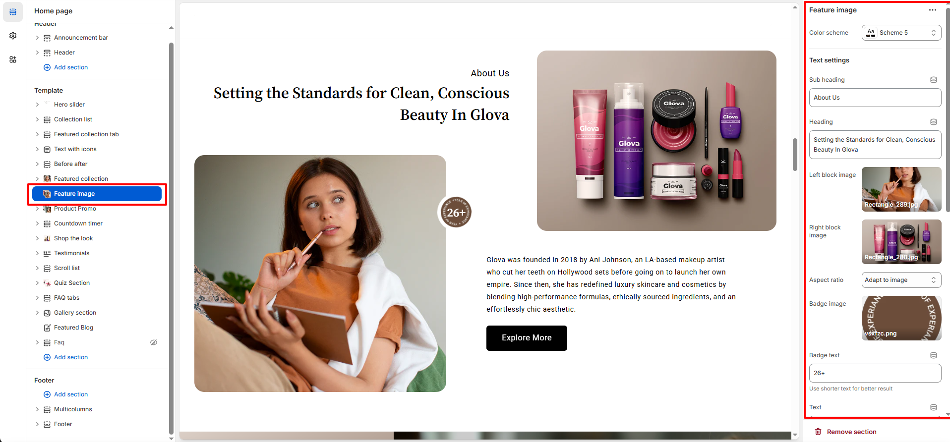
Feature Image Section – Nexus
The Feature Image Section in the Nexus theme is designed to highlight stunning visuals in a clean and modern layout. It allows you to display large, high-quality images that capture attention and enhance the overall aesthetic of your beauty brand. Perfect for showcasing campaign banners,mood images, or promotional graphics, this section brings elegance and impact to any page without requiring product links or details.
Features of the Product Carousel Section:
- Dual-Image Split Layout : Showcase two high-quality images side by side using the Left Block Image and Right Block Image settings—perfect for storytelling, visual comparisons, or highlighting different brand moments.
- Fully Customizable Text Content : Enhance your imagery with a Subheading, Heading, and optional Body Text, giving you complete control over how you introduce your brand or campaign message.
- Adaptive Visual Styling : Choose from multiple Aspect Ratio options and apply a curated Color Scheme to ensure your section matches the overall aesthetic and layout of your Nexus beauty storefront.
- Badge Overlay for Highlight s Use the Badge Image and Badge Text settings to add eye-catching labels—ideal for expressing values, certifications, or quick highlights like “26+”, “New”, or “Clean Beauty.”
How to Set Up the Product Promo Section:
- Go to Online Store → Themes → Customize.
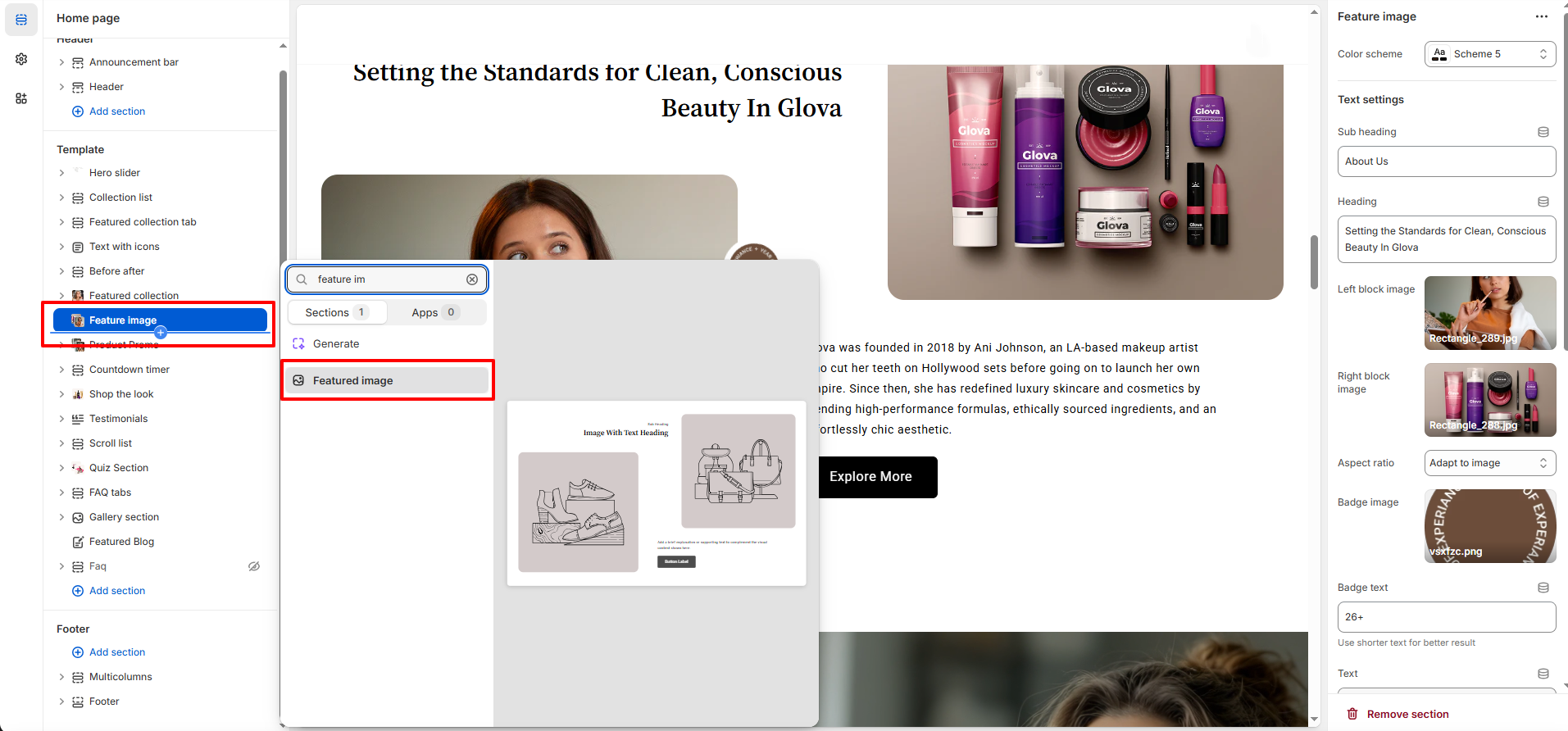
- Scroll to the Feature Image section or add it by clicking Add section → Feature Image.
- In the settings panel, configure the following.
Feature Image Settings:
- Color Scheme: Select from your theme’s predefined color styles to match the section with the overall Nexus aesthetic.
- Sub Heading: Add a short introductory line that appears above the main title (e.g., “About Us”).
- Heading: Enter a bold, attention-grabbing title to communicate your message or highlight your brand story.
- Left Block Image: Upload the primary image that appears on the left side of the split layout.
- Right Block Image: Upload a complementary image displayed on the right side, creating a balanced visual pairing.
- Aspect Ratio: Choose how the images are displayed—use “Adapt to image” for natural proportions or select a fixed ratio for consistent layout control.
- Badge Image: Add a circular or branded badge overlay to emphasize a highlight, certification, or visual stamp.
- Badge Text: Insert short text (e.g., “26+”) that appears inside or near the badge for quick visual emphasis.
- Text: Add descriptive content to tell your brand story, share campaign information, or provide contextual details for the images.
- Button Label: Set the action text for the call-to-action button (e.g., “Explore More”).
- Button Link: Enter the destination URL where the button will redirect visitors.
- Button Style: Choose between Primary or Secondary styling to match your layout and visual hierarchy.
- Open Link in New Tab: Toggle ON if you want the button link to open in a separate browser tab.
Pro Tips:
Use contrasting left and right images to create visual balance and draw attention. Keep your heading
short and impactful, and pair it with a clean badge for added emphasis. For best results, choose
images with similar lighting and color tones to maintain a cohesive beauty aesthetic.