Before After Section – Nexus
The Before after section in Nexus lets you showcase side-by-side visual transformations using an interactive comparison slider. Each slide (Comparison Slider block) contains a "Before" and "After" image, a tab heading label, and an optional linked product card — making it ideal for beauty, skincare, or wellness brands that want to highlight product results in a compelling, interactive format.
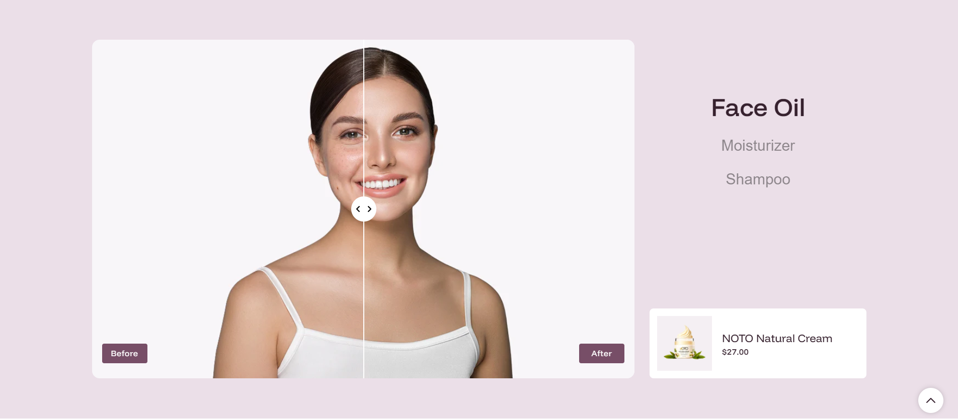
Before After Section Settings
- Color scheme: Select a color scheme (e.g., Scheme 4) to define the background and text colors for the entire Before after section.
Settings
- Before after block height: Set the height of the comparison slider area. Options include Small, Medium (default), and Large. Choose a larger height for a more impactful hero-style presentation, or smaller for a compact in-page section.
Product Card Settings
- Show products: Toggle on to display a product card alongside the comparison slider. When enabled, the product linked to the active Comparison Slider block is shown with its image, title, and price (e.g., "NOTO Natural Cream — $27.00"). Toggle off to hide the product card and show only the image comparison.
- Product image size: Set the aspect ratio of the product image inside the card. Options include Square, Portrait, Landscape, and Adapt (uses the image's natural proportions).
- Show image background: Toggle on to add a solid color background behind the product image in the card, providing a clean, consistent look — especially useful for products shot on transparent or white backgrounds.
- Image background color: When "Show image background" is enabled, set the background color applied behind the product image (e.g., #F4EFF3 for a soft blush tone that complements a beauty brand palette).
Spacing Settings
- Desktop padding top: Set the space above the section on desktop screens (e.g., 40 px).
- Desktop padding bottom: Set the space below the section on desktop screens (e.g., 40 px).
- Mobile padding top: Set the space above the section on mobile screens (e.g., 0 px).
- Mobile padding bottom: Set the space below the section on mobile screens (e.g., 40 px).
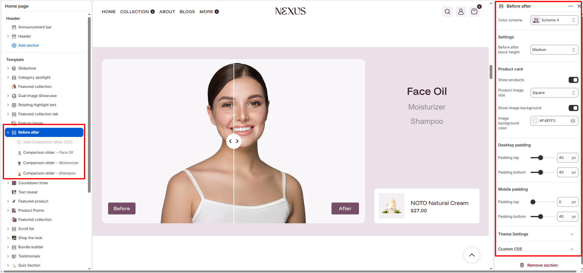
Comparison Slider Block Settings
Each Comparison Slider block added within this section represents one tab in the Before after section (e.g., "Face Oil", "Moisturizer", "Shampoo"). Add multiple blocks using the Add Comparison Slider button. Shoppers click a tab label to switch the active comparison slider to that block.
- Tab heading: Enter the label shown on the navigation tab for this slider (e.g., "Face Oil", "Moisturizer", "Shampoo"). This text appears as a clickable button above the slider, letting shoppers switch between different product comparisons.
- Before image: Upload the image showing the "Before" state — the appearance before using the product (e.g., skin before applying Face Oil). This image is displayed on the left/initial side of the comparison slider.
- Select product: Choose a Shopify product to link with this comparison slider block (e.g., NOTO Natural Cream). When "Show products" is enabled in the section settings, this product's image, name, and price are displayed in the product card beside the slider, allowing shoppers to add it to their cart directly.
- After image: Upload the image showing the "After" state — the result achieved after using the product. This image appears on the right/reveal side of the comparison slider as the user drags the handle.
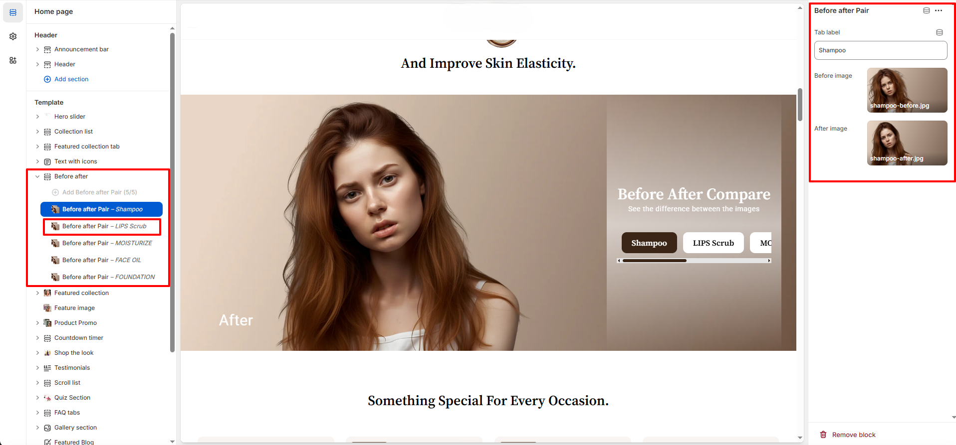
How to Set Up the Before After Section
- Go to Online Store → Themes → Customize.
- On the Home page template, click Before after in the left sidebar, or click Add section → Before after to add it.
- Choose a Color scheme, set the Before after block height, and configure the Product card settings (Show products, image size, background color).
- Click Add Comparison Slider to add a new block. Enter a Tab heading, upload the Before and After images, and select the linked product.
- Repeat to add more comparison sliders for each product or category (e.g., Face Oil, Moisturizer, Shampoo).
- Adjust desktop and mobile padding as needed, then click Save.
Pro Tips:
Use high-resolution, well-lit images for both Before and After shots —
consistent lighting and framing across both images makes the most convincing
comparison.
Keep Tab headings short and descriptive (e.g., "Face Oil", "Serum") so they
fit neatly in the tab navigation bar on all screen sizes.
Always link a product using "Select product" so shoppers can immediately
purchase the product responsible for the transformation they see.
Use a soft image background color (e.g., #F4EFF3) that complements your brand
palette to frame the product card elegantly.