Product Page – Nexus
The Product Page in Nexus is carefully crafted for beauty and skincare brands, delivering a visually rich and conversion-focused shopping experience.
With elegant layouts, immersive product media, and built-in conversion tools, Nexus ensures your products look premium and inspire confidence in every customer.
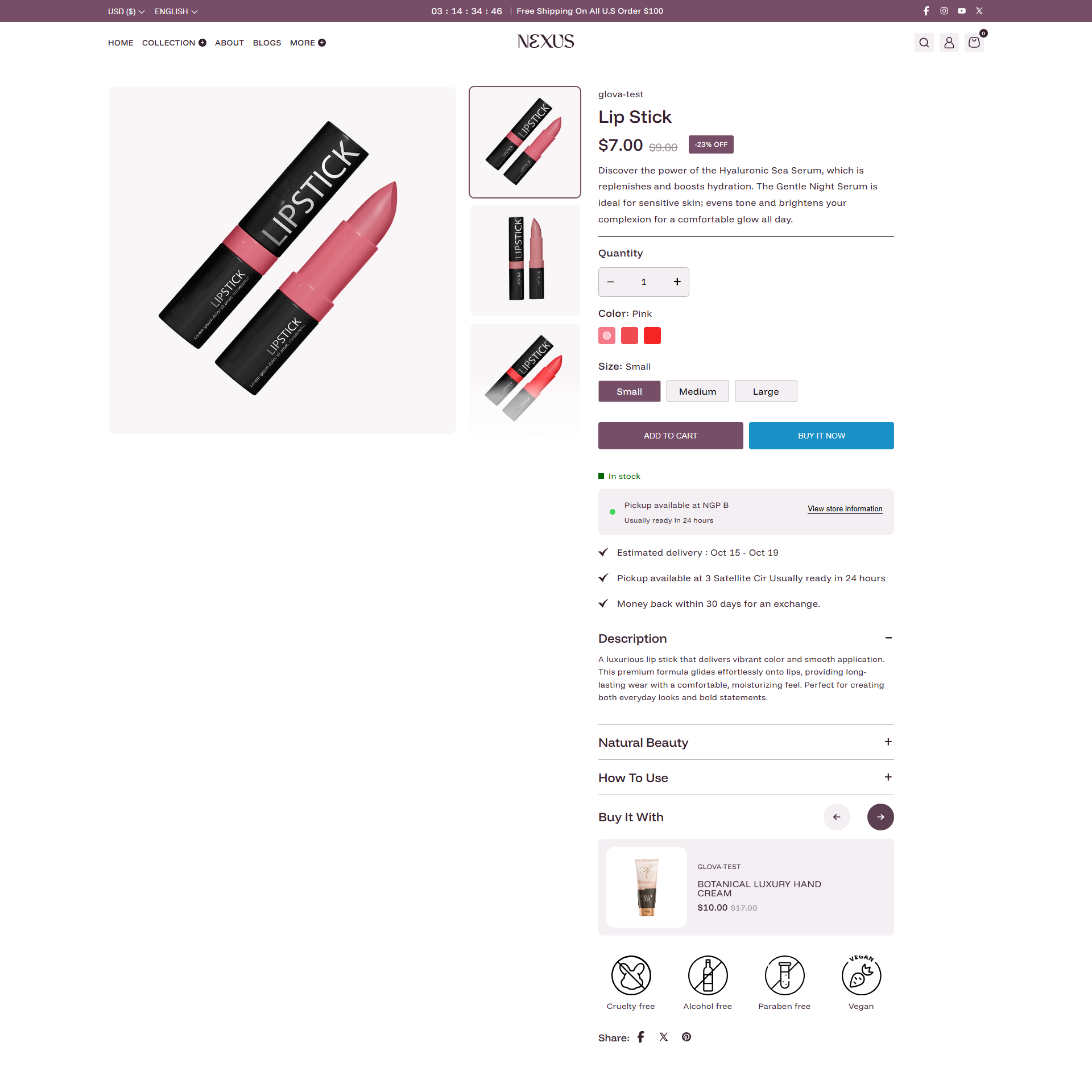
Main Product Section Settings:
Configure the core layout and appearance of your product page using these comprehensive section settings:
-
Color Schemes:
- Color scheme: Set the overall background and text color for the product section (e.g., Scheme 1).
- Gallery color scheme: Choose a specific color scheme for the product image gallery area.
- Sticky Media: Enable Enable sticky media/content to keep product images or details visible while the user scrolls.
-
Media Layout:
- Media width: Choose between Small, Medium, or Large for the image gallery width.
- Thumbnail position: Place thumbnails on the Left, Bottom, or Right of the main image.
- Image size: Select Contain to show the full image or Cover to fill the container.
- Show image background: Toggle this to add a background color behind your product images.
- Image background color: Choose a custom hex color (e.g., #F8F8F8) for the image area.
-
Mobile & Sticky Features:
- Hide arrows on mobile: Toggle this to remove navigation arrows from the mobile image slider.
- Sticky add to cart: Enable a persistent "Add to Cart" button that remains visible at the bottom of the screen on mobile devices.
-
Section Padding:
- Desktop padding: Adjust the vertical spacing (Top/Bottom) for desktop views.
- Mobile padding: Adjust the vertical spacing (Top/Bottom) for mobile views.
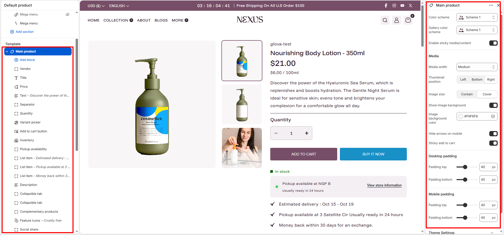
Product Content Blocks
- Nexus’s Product Page is block-based, allowing you to easily add, reorder, or remove content directly from Shopify’s theme editor.
Main Product Block Details:
The product page is built using flexible content blocks. You can add, remove, and reorder these blocks in the theme editor to create the perfect layout. Below is a detailed breakdown of each block:
- Vendor: Displays the manufacturer or brand name of the product.
-
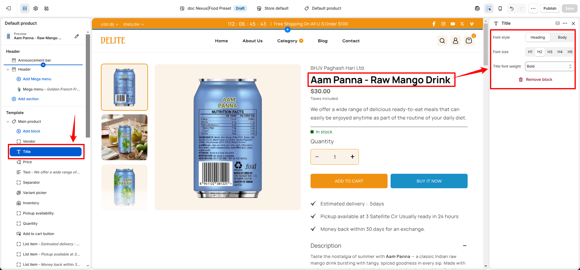
Title: Displays the product name on the product page.
- Font style: Choose between Heading or Body font styles for the product title.
- Font size: Select the title size from H1, H2, H3, H4, or H5 to control visual prominence.
- Title font weight: Adjust the thickness of the product title text to match your store's design style.
- Price: Displays the current price, sale price, and any applicable unit pricing.
- Text: A flexible block for adding short custom messages or promotional taglines.
- Separator: Adds a clean horizontal line to help organize and separate content.
- Quantity: Provides a selector for customers to choose the number of items.
-
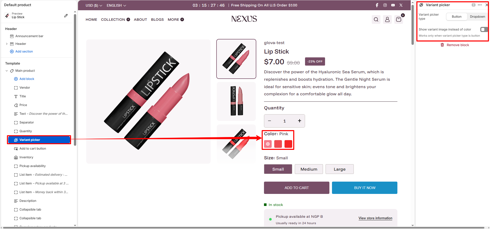
Variant Picker: Displays options like shade, size, or color as clickable swatches or
dropdowns.
- Variant picker type: Choose between Button (swatches) or Dropdown styles to match your store's aesthetic.
- Show variant image instead of color: When enabled, the picker will display the actual variant image instead of a color swatch (this works only when the picker type is set to Button).
-
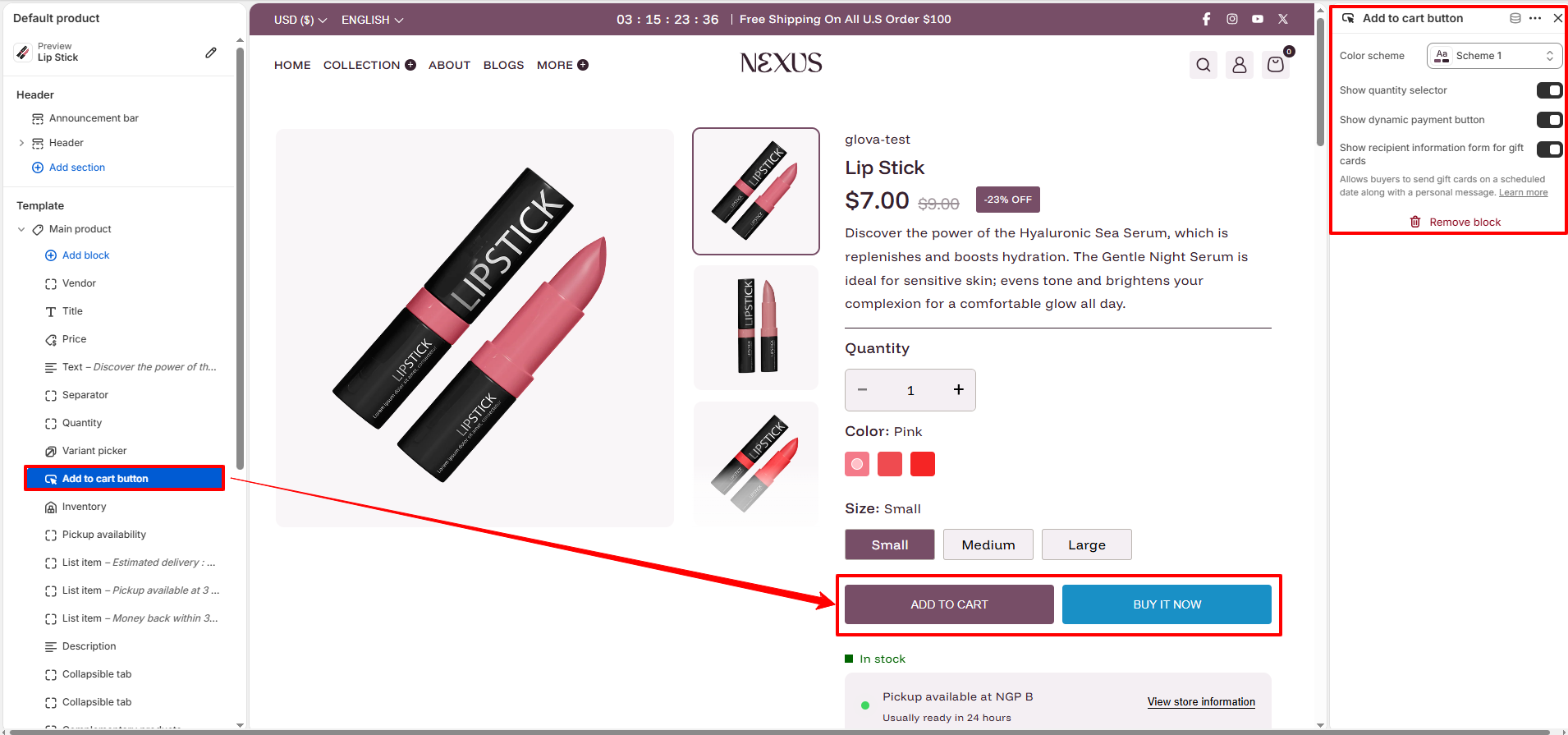
Add to Cart & Buy It Now: The primary conversion buttons for your product page.
- Color scheme: Select a color scheme (e.g., Scheme 1) specifically for these buttons to make them stand out.
- Show quantity selector: Enable this to allow customers to choose the number of units they wish to purchase.
- Show dynamic payment button: Enable this to let customers checkout directly via Shop Pay, Apple Pay, or other preferred methods.
- Show recipient information form for gift cards: If the product is a gift card, this adds a personalized form for the buyer to send it to a recipient.
- Inventory: Displays real-time stock levels. You can set a threshold (e.g., "Low stock if under 10") to create urgency and encourage faster purchases.
- Pickup Availability: Automatically shows if local pickup is available at your store locations based on your Shopify Admin settings.
-
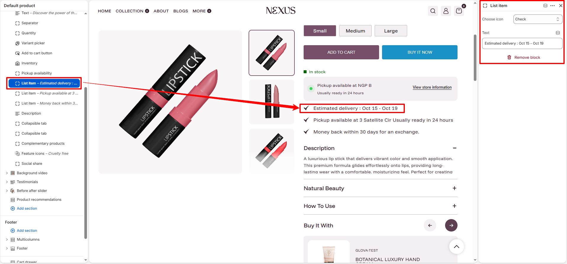
List Items: Specialized blocks for highlighting key perks like Estimated
delivery, Return policies, or Quality guarantees.
- Choose Icon: Select from a library of built-in icons (e.g., check,question,etc) to visually represent the information.
- Text: Enter the custom message or detail you want to display (e.g., "Estimated delivery: Oct 15 - Oct 19").
- Description: Pulls the full product description from your Shopify Admin.
-
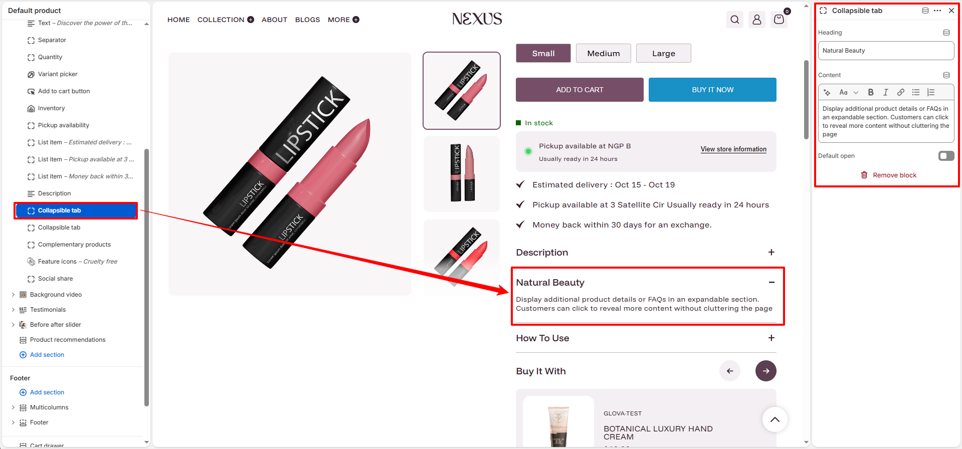
Collapsible Tabs: Accordion-style sections for ingredients, FAQs, or usage guides.
You can add multiple tabs with unique headings and content to keep your page organized.
- Heading: Enter the title of the tab (e.g., "Natural Beauty" or "How To Use").
- Content: Add detailed text, lists, or links using the rich text editor to highlight product benefits.
- Default open: Toggle this if you want the tab to be expanded by default when the page loads.
-
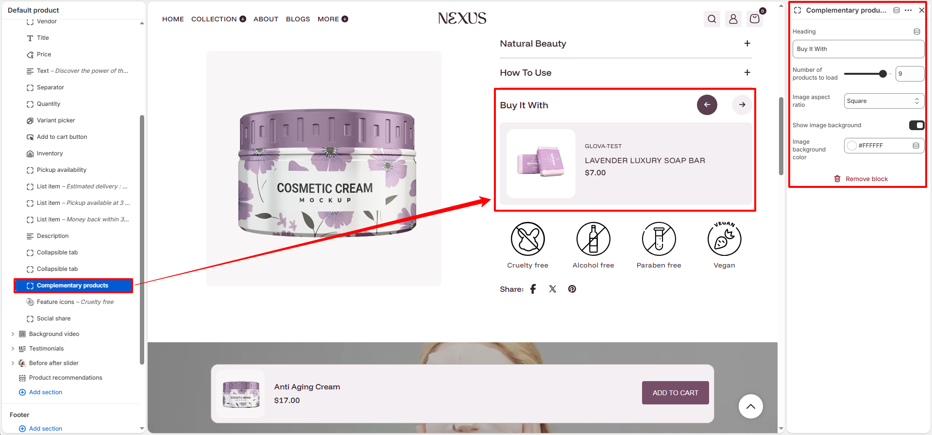
Complementary Products: Recommend related beauty products such as serums or brushes
to increase order value.
- Heading: Set a custom title for the section (e.g., "Buy It With").
- Number of products to load: Adjust the slider to choose how many recommendations to display.
- Image aspect ratio: Choose the shape of product images (Square or Portrait).
- Show image background: Toggle this to add a background color behind product images.
- Image background color: Select a custom background color (e.g., #FFFFFF).
-
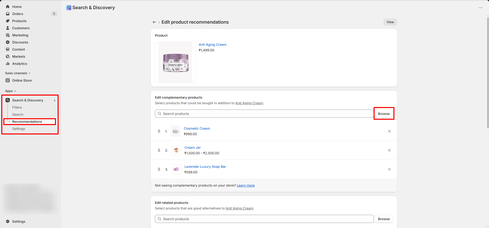
How to Add Complementary Products:
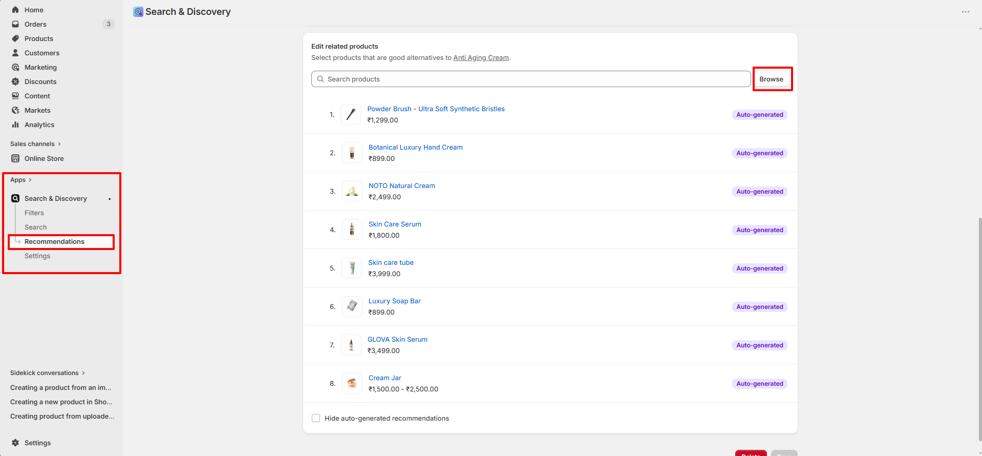
- Install the Shopify Search & Discovery app from the Shopify App Store.
- Open the app and navigate to Product Recommendations.
- Select the product you want to edit and assign related items under the Complementary products section.
- Save your changes, and they will automatically appear in this block.
-
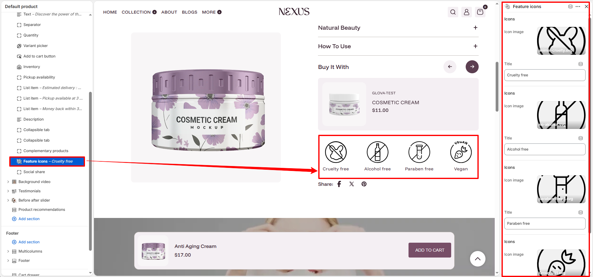
Feature Icons: Showcase your brand's commitment to quality and values (e.g.,
Cruelty-free, Vegan, Paraben-free) using custom
icons.
- Icon image: Upload or select an SVG/image file that represents the feature.
- Title: Enter the name of the value or feature (e.g., "Cruelty free").
-
Social Share: Enables customers to share your products on their social networks.
- Enable sharing: Toggle this to show or hide social sharing icons (Facebook, X/Twitter, Pinterest).
-
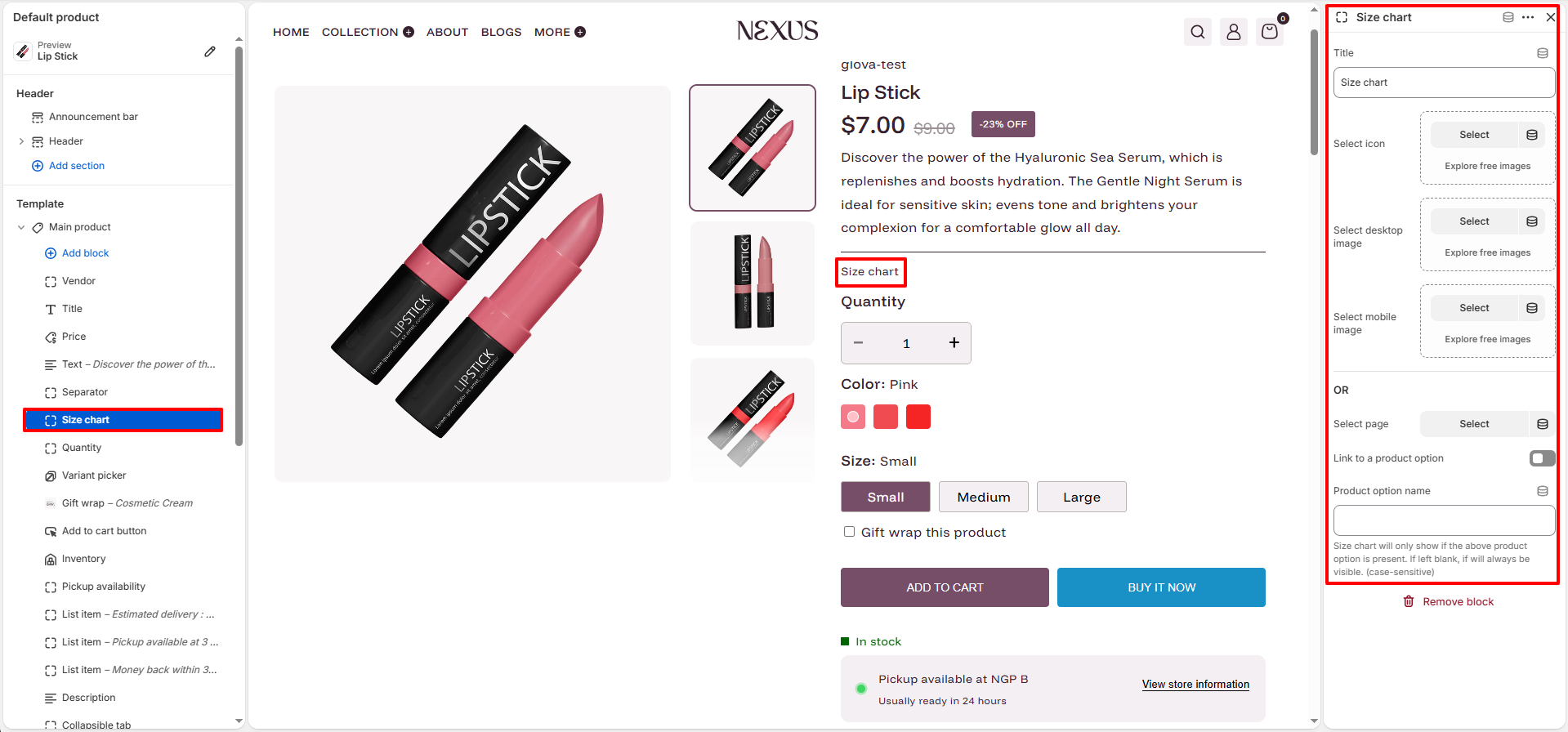
Size Chart: Helps customers find the right fit, reducing returns. Nexus offers
flexible options for displaying your size guides.
- Title: Set the link text displayed on the product page (e.g., "Size chart").
- Display Options (Images):
- Select Icon: Choose a small icon to appear next to the link.
- Select desktop/mobile image: Upload separate guide images optimized for different screen sizes.
- OR Select Page: Instead of images, link to a dedicated Shopify Page containing your size chart data.
- Product Option Trigger:
- Link to a product option: Enable this to only show the size chart when a specific product option exists.
- Product option name: Enter the option name (e.g., "Size") that triggers the block's visibility.
- SKU: Displays the Stock Keeping Unit for the currently selected variant.
-
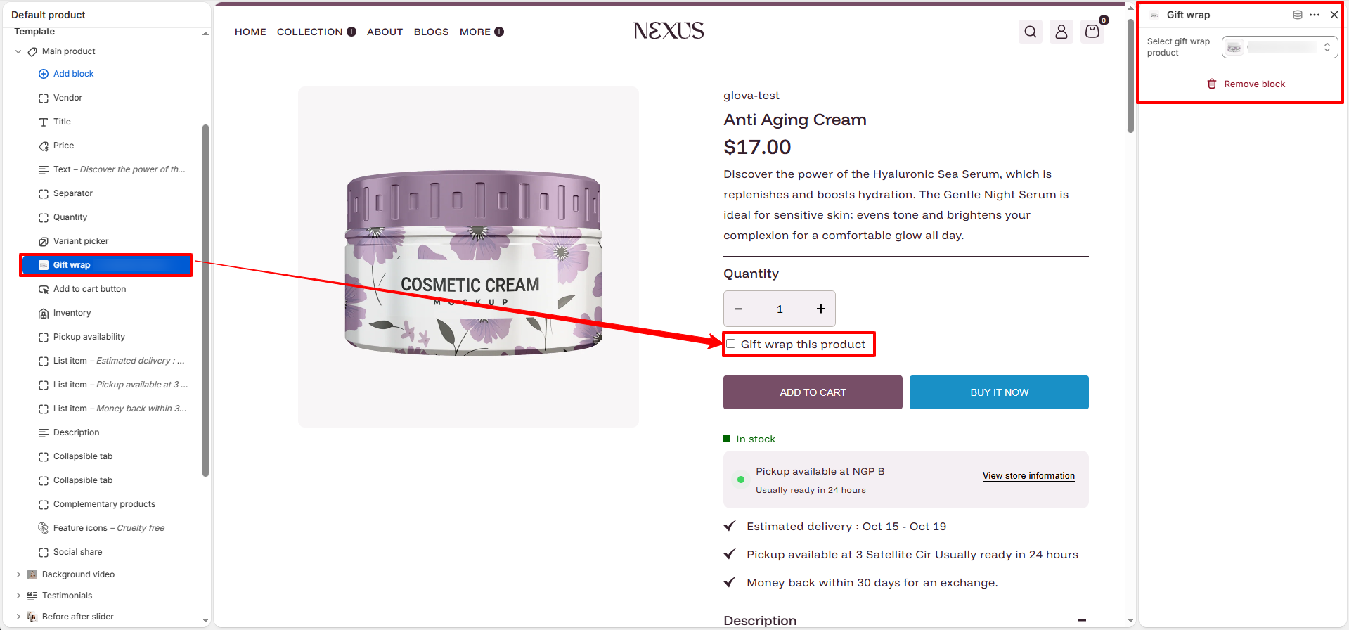
Gift Wrap: Allow customers to add a gift wrapping service directly from the product
page.
- Select gift wrap product: Choose a specific product from your Shopify Admin to act as the gift wrap option (e.g., a $5 "Gift Wrap" product).
- Usage: When a customer checks the "Gift wrap this product" box, the selected gift wrap product is automatically added to their cart alongside the main item.
Product Recommendations
The Product Recommendations section encourages discovery by showing related items at the bottom of the product page.
-
Section Settings:
- Color scheme: Select the background and text color for the entire section.
- Heading: Enter the title for the section (e.g., "Related Products").
- Number of products to load: Set how many recommendations to display (up to 10).
- Number of columns per row: Choose how many items appear in a single row on desktop (e.g., 4).
-
Product Card Styling:
- Image aspect ratio: Set the shape of the product images (Portrait, Square, etc.).
- Show secondary image on hover: Reveal the second image in your product gallery when a customer hovers over the card.
- Quick View: Enable a popup so customers can see product details without leaving the page.
- Image background: Add a subtle background color (e.g., #F9F8F8) to make product images pop.
How to Configure Recommendations:
Follow these steps in the Shopify Search & Discovery app to manage how products are assigned to this section.
Steps
- Go to your Shopify Admin.
- Navigate to Apps and open the Search & Discovery app.
- Click on the Recommendations section inside the app.
- Select a product for which you want to configure recommendations.
- Add related or recommended products that should appear on the product page.
- Save the changes to apply the recommendations.
How to Customize the Product Page
- Go to Online Store → Themes → Customize
- Select Products → Default Product from the top dropdown
- Add, remove, or rearrange blocks as needed
- Adjust settings using Nexus’s theme controls
- Save your changes