Header Settings
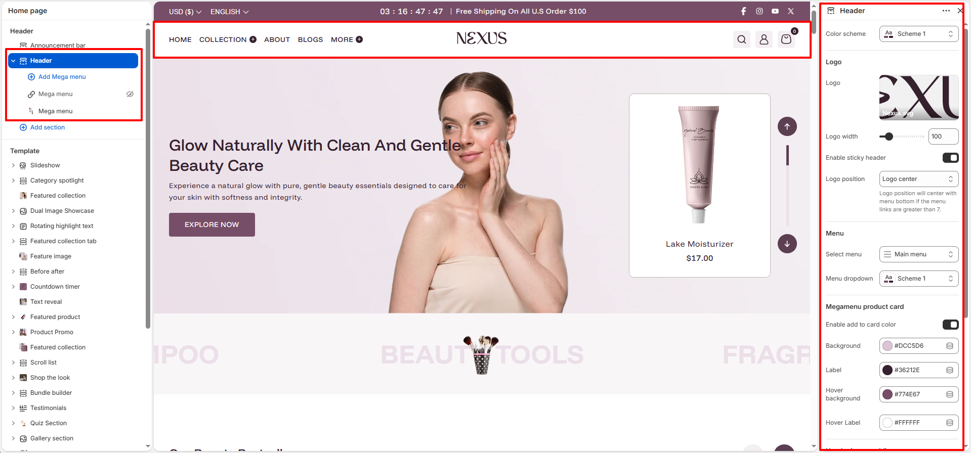
The Header is the very first element shoppers notice when they enter your store. With the theme, you have complete flexibility to customize the header’s layout, menu structure, and logo positioning, ensuring it aligns perfectly with your beauty brand’s look and feel.
Header Configuration Settings:
- Color Scheme: Select a color scheme for the header to define its background and text colors, ensuring it matches your overall theme.
- Logo Image: Upload your store's logo and use the Logo width slider to scale its size for the desktop layout.
- Enable sticky header: When turned on, the header will remain visible at the top of the screen while customers scroll through your store.
- Logo position: Choose where your logo appears (e.g., center or left) and how the navigation menu is arranged around it.
- Menu Selection: Assign your primary navigation menu and select a specific Menu dropdown color scheme for sub-menus.
-
Megamenu Product Card:
- Enable add to card color: Toggle this on to apply custom background and label colors to the product cards within your mega menus.
- Background & Label: Customize the base color of the product card and its text labels.
- Hover Background & Label: Define the colors that appear when a customer hovers their mouse over the product card.
- Header Inner Padding: Adjust the internal top and bottom spacing to control the height and "breathing room" of the header bar.
- Header Outer Padding: Set the external top and bottom spacing to create margin between the header and other page elements.
Navigation Styles:
The Nexus theme provides two powerful ways to organize your store's navigation: Drop-down Menus and Mega Menus. This flexibility allows you to choose the best experience for your customers based on the complexity of your product catalog.
1. Drop-down Navigation
Standard drop-down menus are the classic choice for simple, link-based navigation. When a customer hovers over a main menu item, a clean vertical list of sub-links appears.
- Best for: Stores with a straightforward set of categories or fewer sub-links.
- Appearance: A simple, vertical list that matches your theme's typography and color scheme.
How to Create a Drop-down Menu:
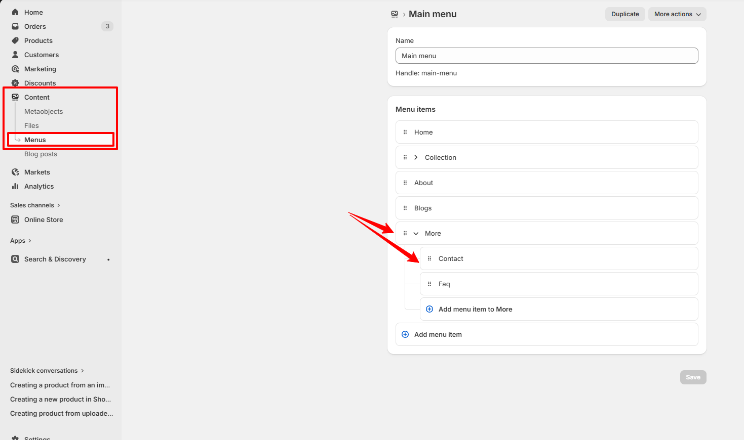
Drop-down menus are created by nesting menu items within the Shopify Admin navigation settings.
- In your Shopify admin, go to Online Store → Navigation.
- Click the name of your main menu (e.g., Main menu).
- Add menu items, then click and drag the handle icon (⋮⋮) to nest them under a parent item.
- Click Save menu.
Assigning the Drop-down Style:
Once your menu is created, you can customize its appearance in the theme editor.
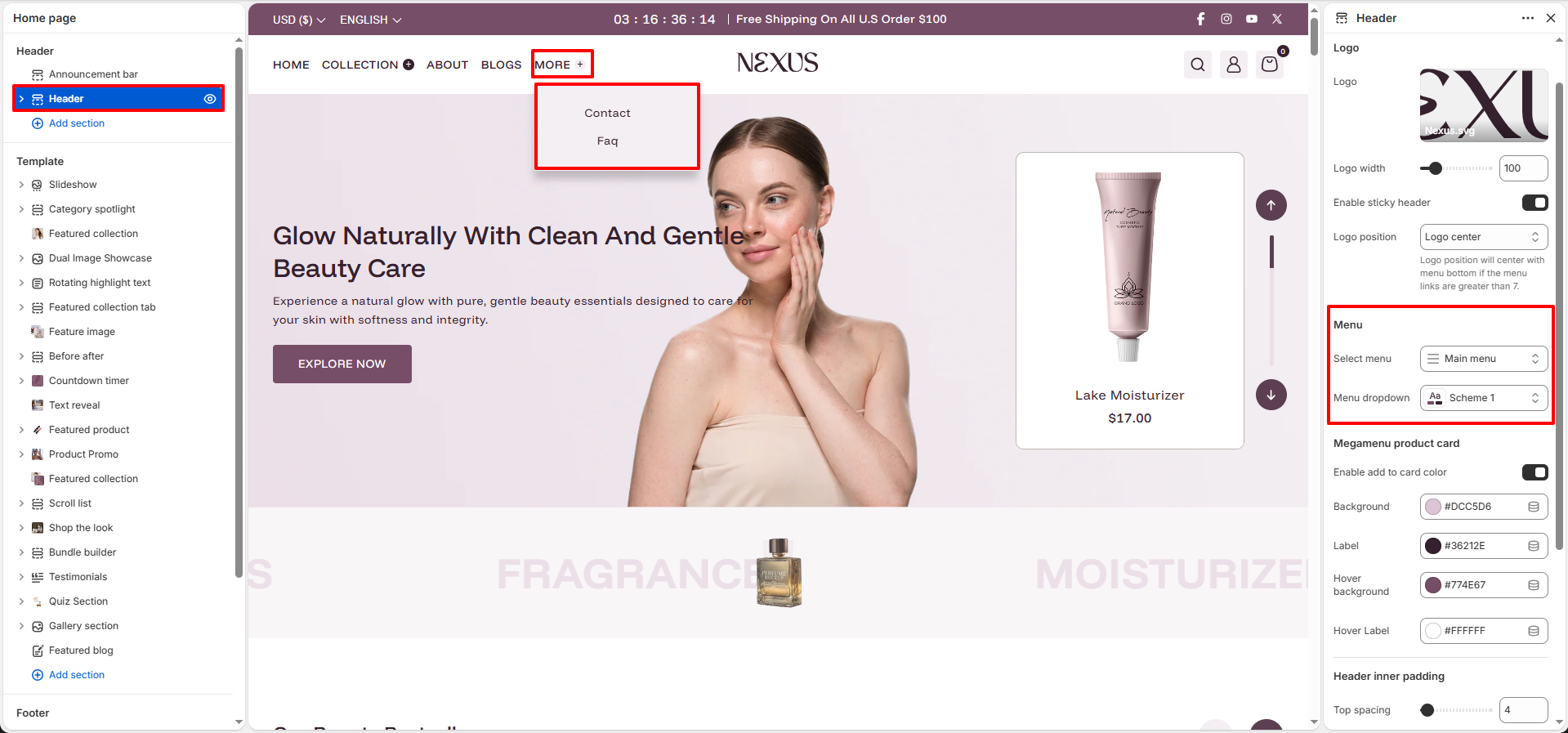
- Select Menu: Choose the menu you just configured in the Shopify Admin.
- Menu Dropdown: Select a color scheme (e.g., Scheme 1) to apply to the dropdown panel.
2. Mega Menu Navigation
Mega menus are high-impact, expandable panels that can display multiple columns of links alongside featured images and products. They transform your navigation into a visual discovery tool.
- Best for: Showcasing specific products, promotions, or large categories with many sub-sections.
- Appearance: A wide, multi-column panel that provides a rich and interactive browsing experience.
How to Create Mega Menu Navigation in Shopify Admin:
A mega menu is built upon a standard nested menu structure in your Shopify Admin. The theme then takes this structure and transforms it into a multi-column visual layout.
- In your Shopify admin, go to Online Store → Navigation and select your Main menu.
- Create a top-level menu item (e.g., Collection). This name will be your target text used in the theme editor.
- Add the categories or links you want to display in the mega menu as sub-items, and drag them underneath your top-level item to nest them.
- Click Save menu.
Mega Menu Configuration Settings:
Configure your mega menu blocks with these straightforward settings to create a visual and engaging navigation experience:
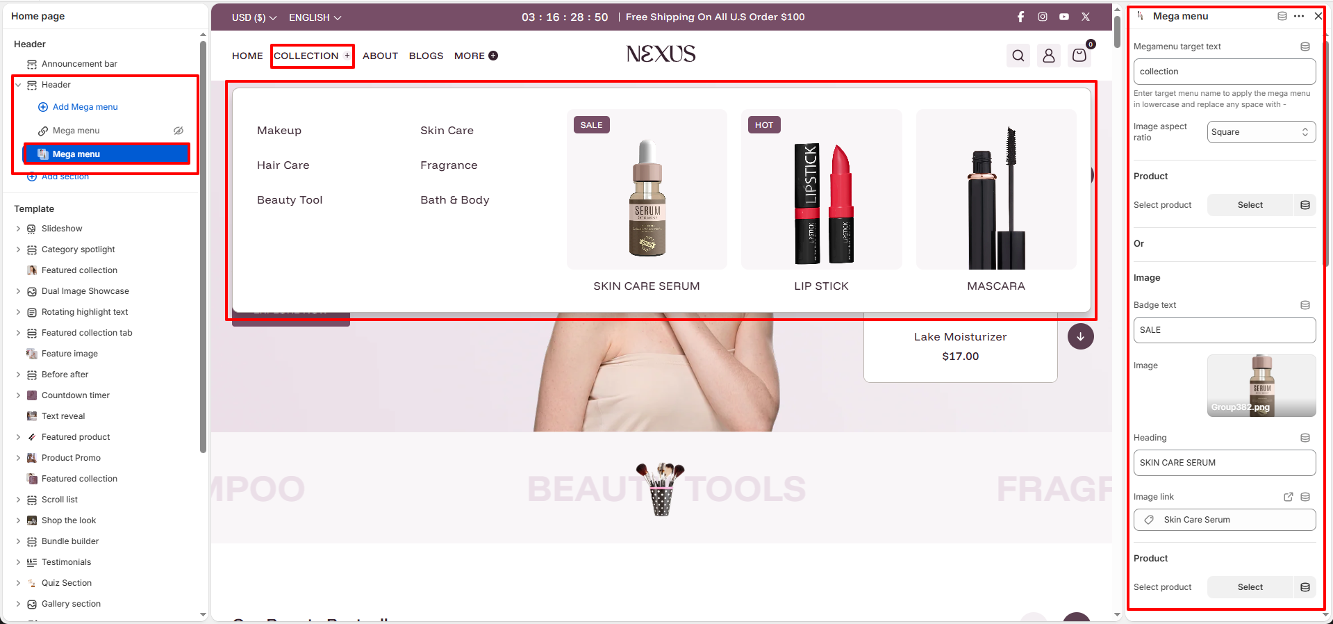
- Megamenu target text: This tells the theme which menu item should trigger this mega menu. Enter the exact name of your main menu link in lowercase and replace any spaces with hyphens (e.g., if your menu says "New Arrivals", enter "new-arrivals").
- Image aspect ratio: Control the shape of your featured images (e.g., Square, Portrait, or Adapt to image) to keep your layout uniform.
- Featured Product: Select a specific product to showcase directly in the menu for quick access.
-
Custom Image Banners:
- Badge text: Add a promotional label (like "SALE" or "HOT") over the image.
- Image, Heading & Link: Upload a custom banner, give it a title, and assign a destination URL.
-
Product Card Settings:
- Show secondary image on hover: Flips to the second product image when hovered.
- Enable quick view: Adds a button for customers to preview product details instantly.
- Show image background: Adds a subtle background color behind product images, perfect for transparent PNGs.