Theme Settings Overview – Nexus
The Nexus Shopify Theme provides a versatile set of customization tools, allowing you to craft a store that perfectly reflects your beauty brand—without any coding knowledge.
To access these settings, log in to your Shopify Admin, navigate to Online Store > Themes, and click Customize. In the theme editor, click the Theme settings icon (the gear icon) in the left sidebar to access global configuration options.
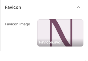
Favicon:
A favicon is a small icon that appears in the browser tab of your store. It helps in brand recognition and gives your site a professional look.
- Favicon image: Upload a square image (recommended 32x32px). Shopify will automatically scale it to the correct size for browser tabs and bookmarks.
Typography:
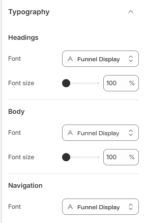
Typography plays a crucial role in your store's branding. You can customize the fonts and sizes for headings, body text, and navigation to create a cohesive and professional look.
- Headings: Select the font family and adjust the base font size for all headings across your store.
- Body: Choose the primary font and size for descriptions, product details, and general text content.
- Navigation: Customize the font for your menu links and navigation elements to ensure optimal readability.
Layout:
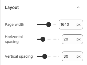
Adjust the overall structure and spacing of your store to ensure a balanced and visually appealing design.
- Page width: Set the maximum width for your store's content to control how much screen space it occupies.
- Horizontal spacing: Used to set the gap between grid items horizontally, such as in the collection list, product grids, and other multi-column sections.
- Vertical spacing: Used to set the gap between grid items vertically, ensuring consistent spacing across your store's grid layouts.
Colors:
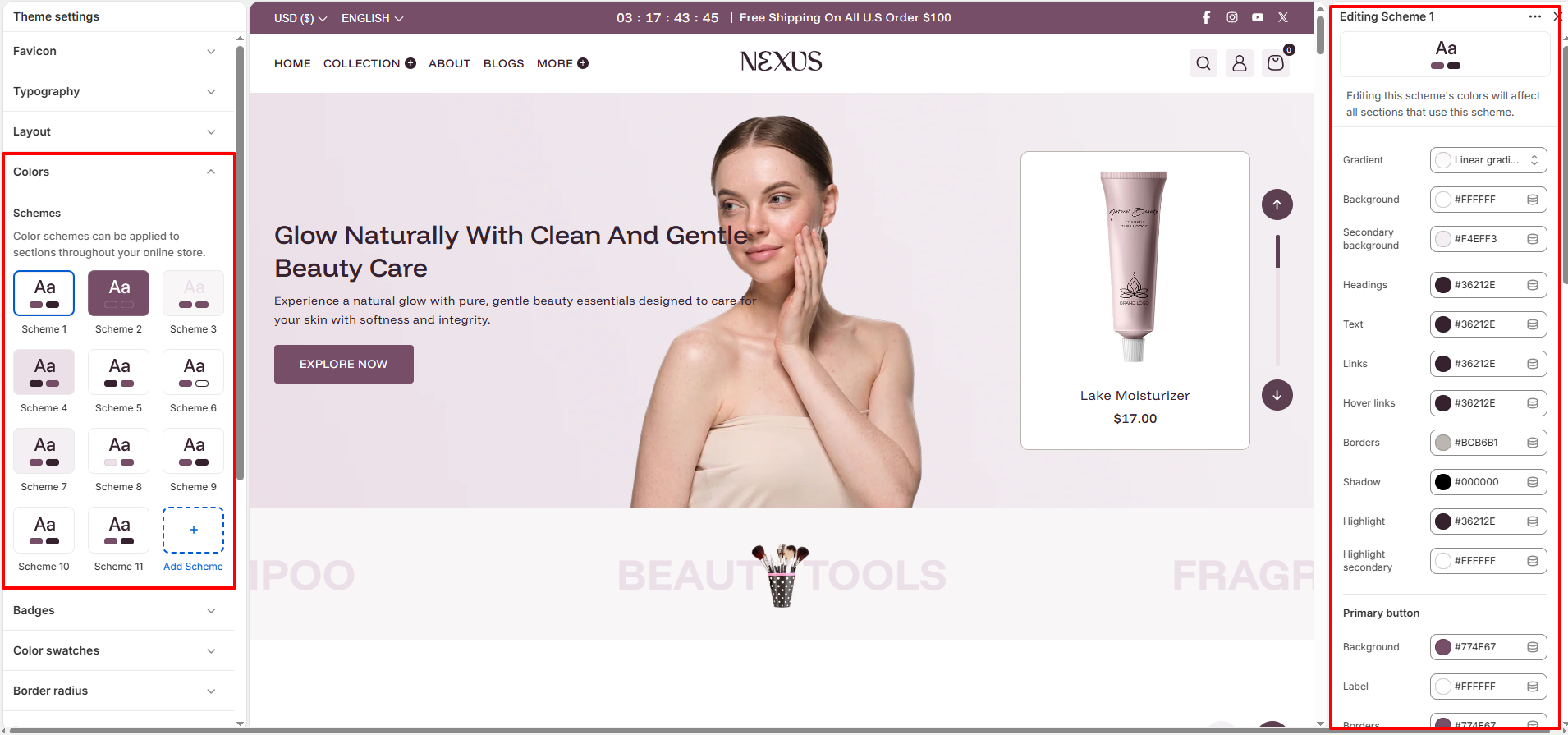
Color schemes are a powerful way to manage your store's branding globally. Instead of setting colors for each element individually, you define "schemes" that contain a harmonious set of colors for backgrounds, text, buttons, and more.
What Color Schemes Do: They allow you to quickly change the entire look of a section by selecting a different scheme. For example, you can have a "Light" scheme for your main content and a "Dark" scheme for your footer or specific promotional banners.
- Custom Schemes: Customize multiple schemes with specific colors for backgrounds, text, headings, links,buttons and borders.
Badges:
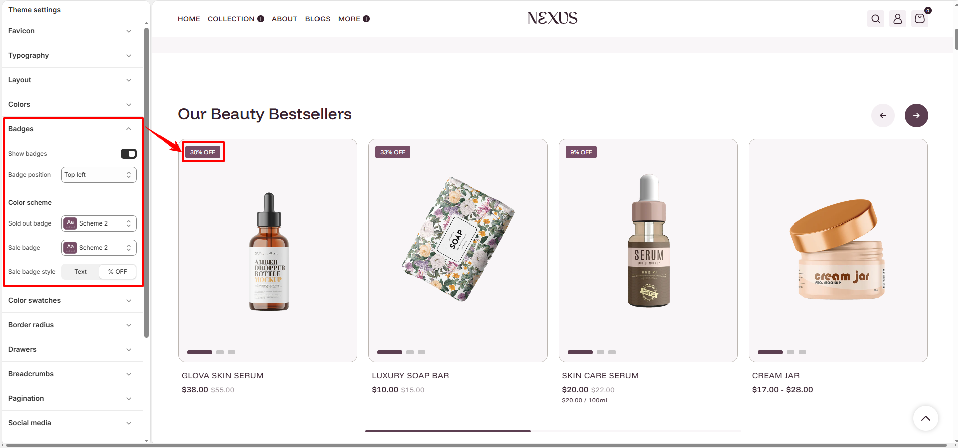
Badges are an effective way to highlight product status, such as "Sale" or "Sold Out," directly on product cards to catch the customer's attention.
- Show badges: Enable or disable badges globally across all product cards.
- Badge position: Choose the corner where the badge will be displayed (e.g., Top left, Bottom right).
- Color schemes: Assign specific color schemes for "Sold out" and "Sale" badges to ensure they stand out or match your brand.
- Sale badge style: Choose between displaying "Sale" text or the actual percentage discount (e.g., 20% OFF).
Color swatches:
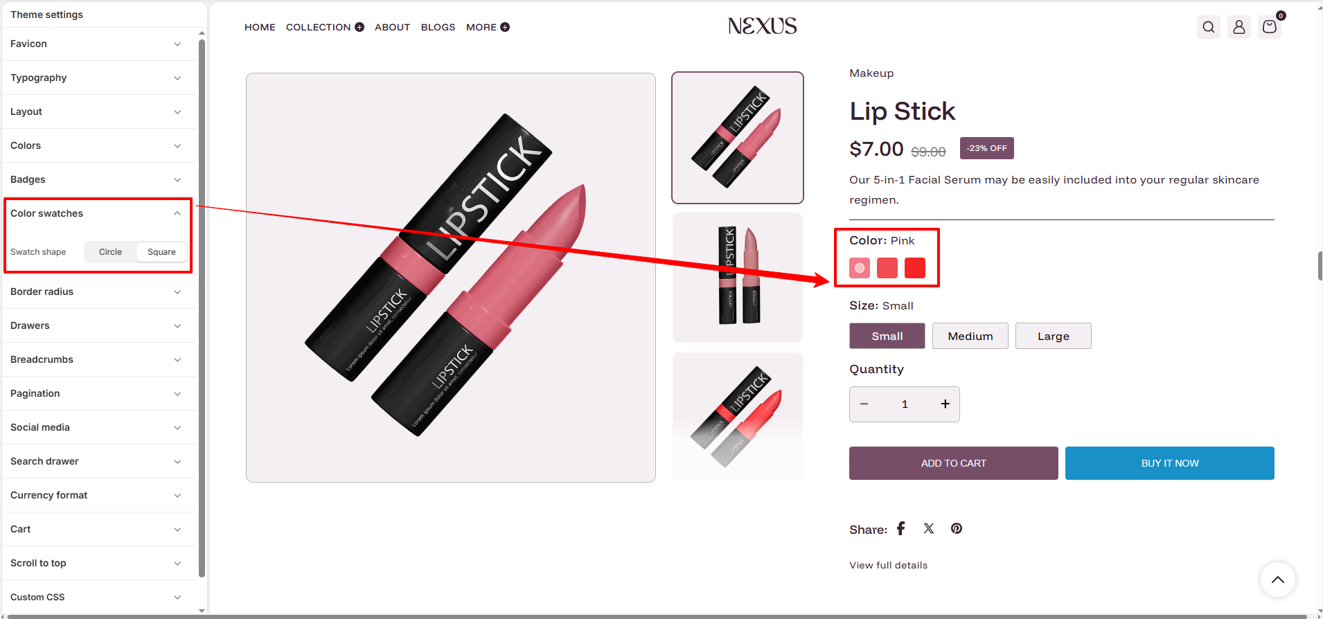
Color swatches allow customers to see available product colors visually, enhancing the shopping experience on both product cards and product pages.
- Enable color swatches: Toggle this option to display color swatches across your store.
- Swatch shape: Choose between Circle or Square styles for your color indicators.
- Visual Feedback: Selecting a swatch can automatically update the product image to match the chosen variant.
Border radius:
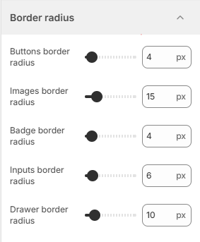
Customize the roundness of various elements throughout your store to match your brand's style—whether it's sharp and modern or soft and organic.
- Buttons border radius: Set the corner roundness for all buttons.
- Images border radius: Adjust the corner radius for product images and other media.
- Badge border radius: Control the roundness of product status badges.
- Inputs border radius: Customize the corner roundness for form fields and search bars.
- Drawer border radius: Adjust the roundness of side drawers like the cart drawer.
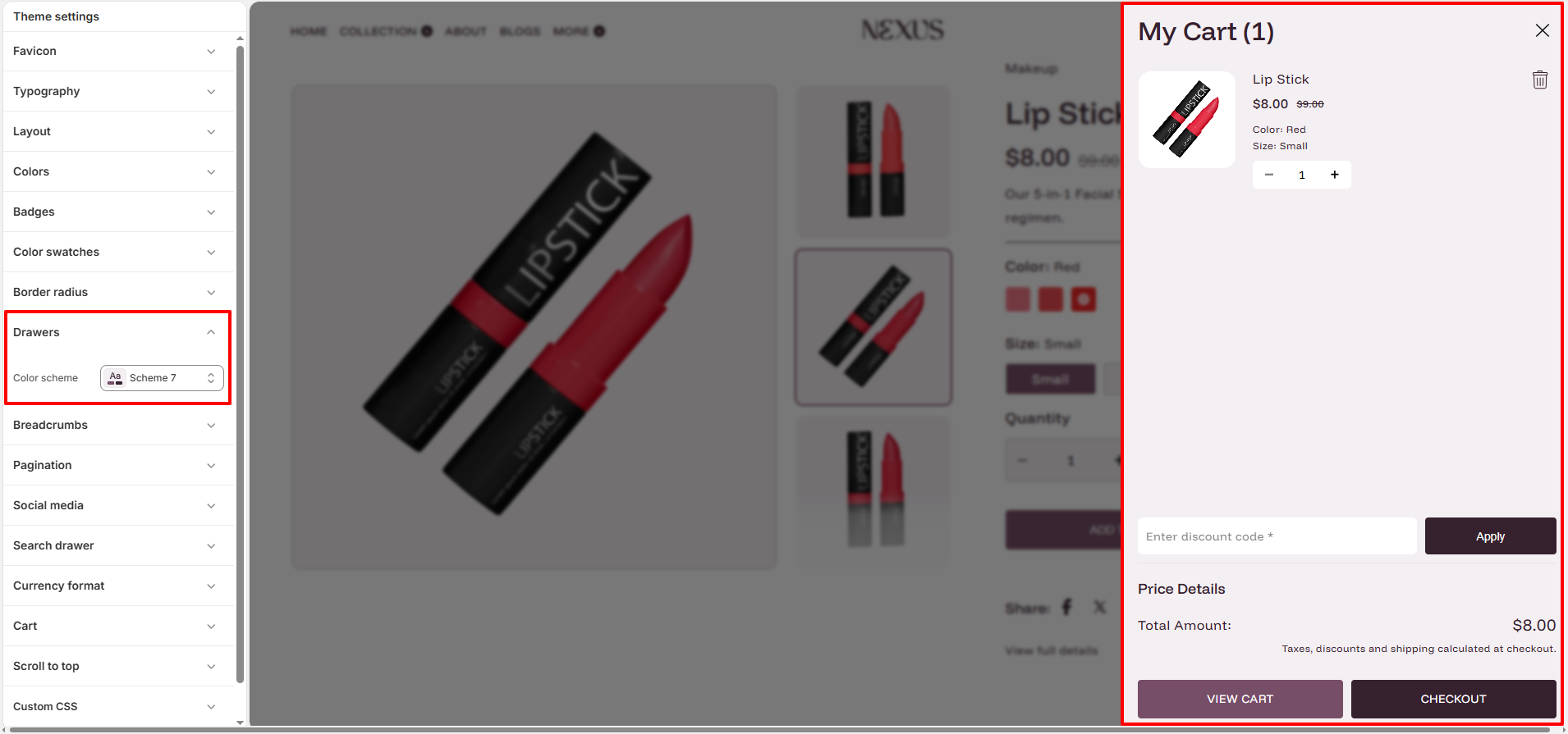
Drawers:
Drawers are sliding panels that appear from the side of the screen, commonly used for the cart, search or navigation menus.
- Color scheme: Assign a specific color scheme to your drawers to create a distinct look that complements your theme.
- Smooth Interaction: Drawers provide a fast and seamless way for customers to view their cart or menu without leaving the current page.
Product Card:
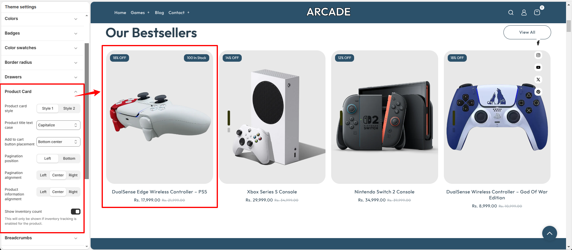
The Product Card settings let you customize the appearance and layout of products displayed across your store. You can adjust the card style, text formatting, button placement, pagination, alignment, and inventory display to match your store's design.
- Product card style: Choose between the available product card layouts (Style 1 or Style 2).
- Product title text case: Select how product titles are displayed, such as using capitalized text.
- Add to cart button placement: Choose where the Add to Cart button appears on the product card.
- Pagination position: Set the position of the product card pagination controls (Left or Bottom).
- Pagination alignment: Align the pagination controls to the Left, Center, or Right.
- Product information alignment: Align the product information within the card to the Left, Center, or Right.
- Show inventory count: Displays the available inventory on the product card. This option is only visible when inventory tracking is enabled for the product.
Breadcrumbs:
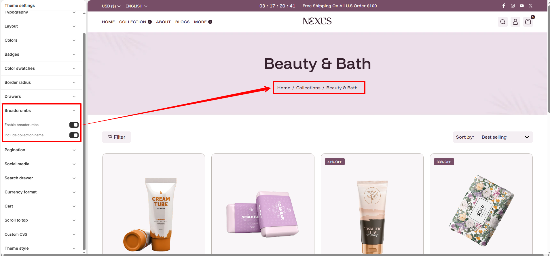
Breadcrumbs provide a secondary navigation path, helping customers understand their current location within your store and easily navigate back to previous categories or the homepage.
- Enable breadcrumbs: Toggle this option to show or hide the navigation trail on collection and product pages.
- Include collection name: Choose whether to display the collection name in the path for more detailed navigation context.
Pagination:
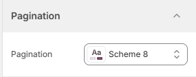
Pagination helps organize your store's collection and search result pages by dividing large numbers of products into manageable pages.
- Color scheme: Select a color scheme for the pagination buttons to ensure they are clearly visible and consistent with your theme's design.
Social media:
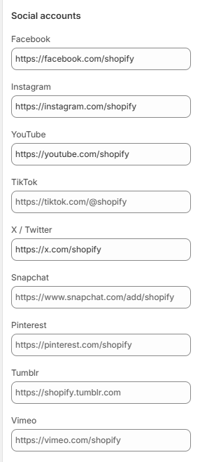
Connecting your social media accounts allows you to display icons in your footer and other areas, helping you build a community and stay connected with your customers.
- Social Accounts: Enter the full URLs for your social media profiles (e.g., Facebook, Instagram, YouTube, TikTok, X/Twitter, etc.).
- Auto-Display: Once URLs are entered, social media icons will automatically appear in the footer and other designated social areas of the theme.
Search drawer:
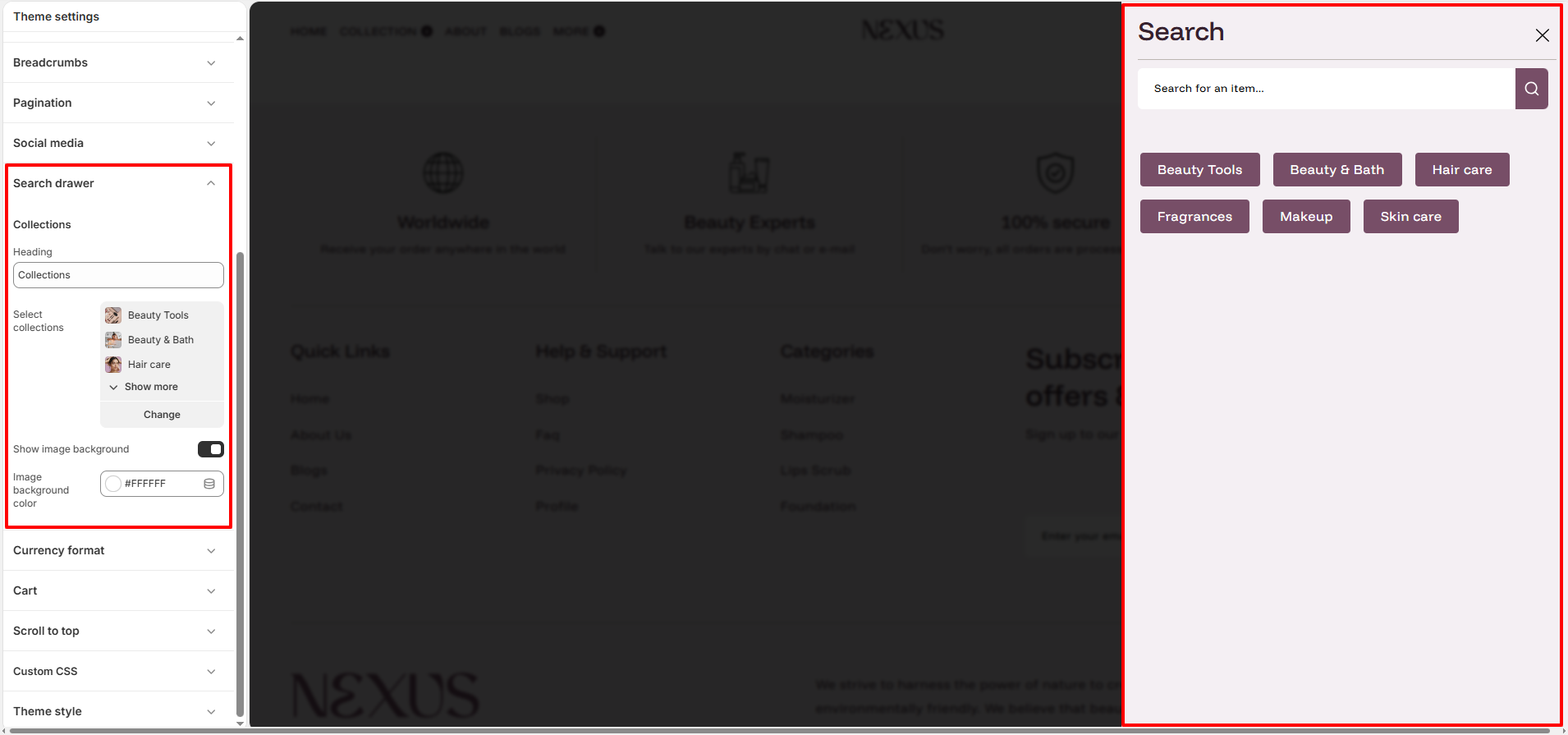
The search drawer provides a quick and interactive way for customers to find products while highlighting key collections for easier discovery.
- Collections Heading: Customize the title for the suggested collections shown below the search bar.
- Select Collections: Choose specific collections to feature as quick-access buttons within the drawer.
- Show image background: Enable this to add a consistent background to product images within the search results. This is especially useful for products that have transparent backgrounds.
- Image background color: If the background option is enabled, this specific color will be applied behind the product images in the search results.
Currency format:
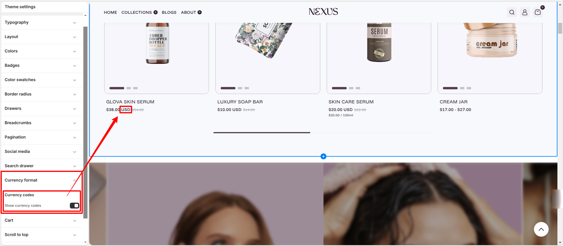
The currency format settings allow you to control how prices are displayed throughout your store, making it easier for customers to identify the selected currency.
- Currency codes: Enable this option to display the ISO currency code (such as USD, EUR, or GBP) alongside prices across your storefront.
- Show currency codes: Turn this setting on to make currency codes visible with all product prices, helping customers clearly distinguish between currencies, especially in multi-currency stores.
Cart:
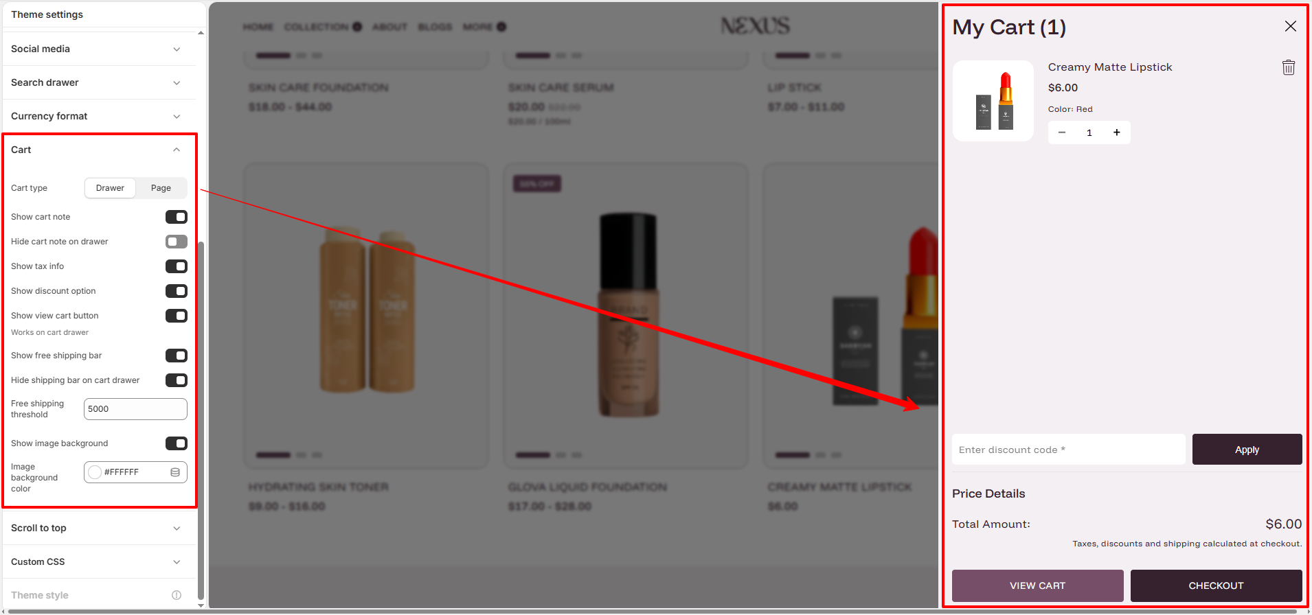
Configure how your cart functions and what information is displayed to customers to optimize the checkout process.
- Cart type: Select between a Drawer that slides out or a separate Page for the cart.
- Show cart note: Enables a text area for customers to add special instructions or notes to their order.
- Hide cart note on drawer: If enabled, the cart note will only be visible on the cart page and hidden in the drawer.
- Show tax info: Displays tax and shipping information messages in the cart area.
- Show discount option: Adds a discount code input field directly within the cart drawer.
- Show view cart button: (Works on cart drawer) Adds a dedicated button that takes the user to the full cart page.
- Show free shipping bar: Displays a progress bar showing how much more the customer needs to spend to qualify for free shipping.
- Hide shipping bar on cart drawer: If enabled, the free shipping bar will be hidden in the drawer but still visible on the cart page.
- Free shipping threshold: Set the minimum order amount required to trigger the free shipping offer.
- Show image background: Adds a background to product images in the cart (useful for transparent images).
- Image background color: Choose the specific background color for product images in the cart.
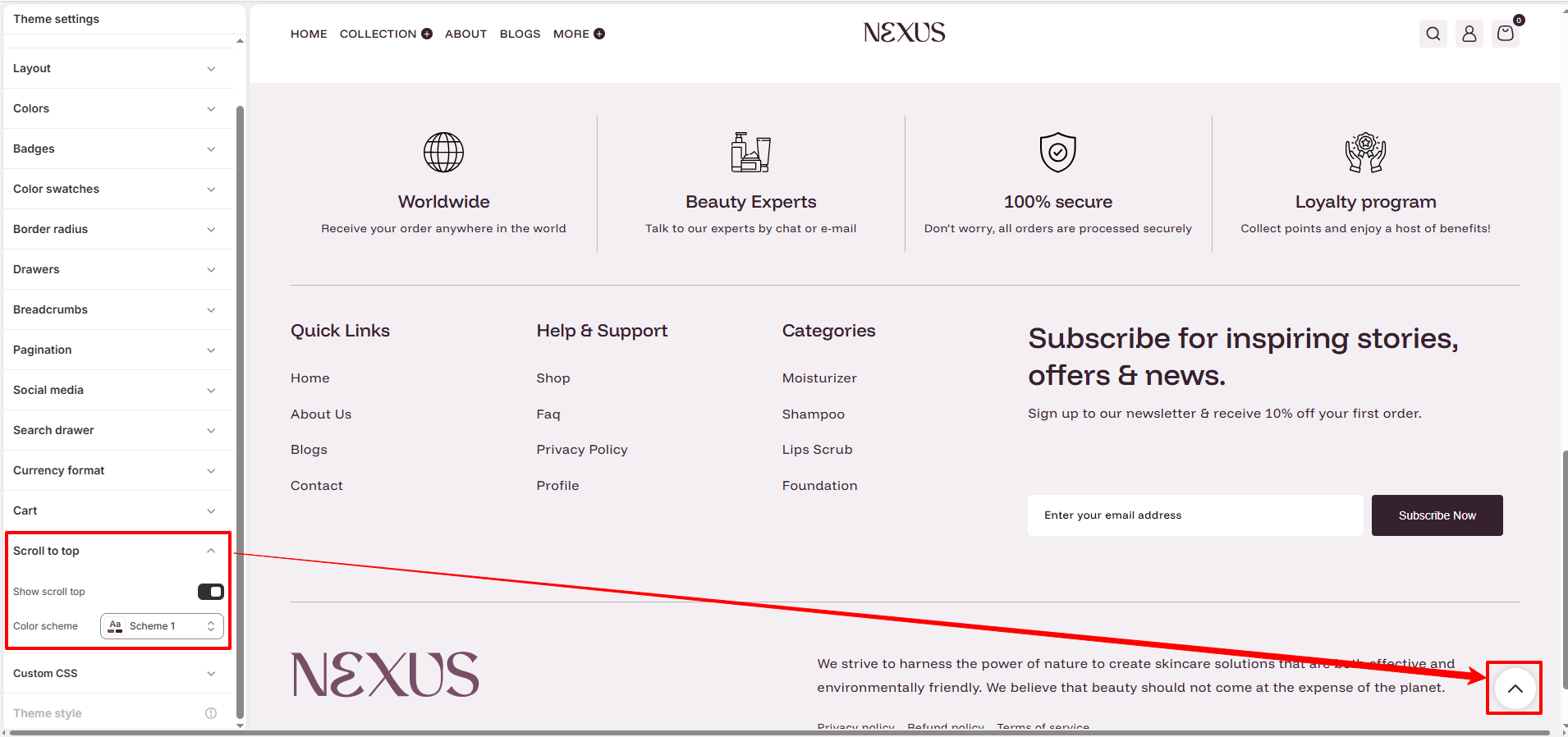
Scroll to top:
The "Scroll to top" button provides a convenient way for customers to quickly return to the top of the page, improving the user experience especially on long pages.
- Show scroll top: Toggle this option to enable or disable the scroll-to-top button across your entire store.
- Color scheme: Select a color scheme for the button to ensure it is visible and matches your theme's branding.