Countdown Timer Section – Nexus
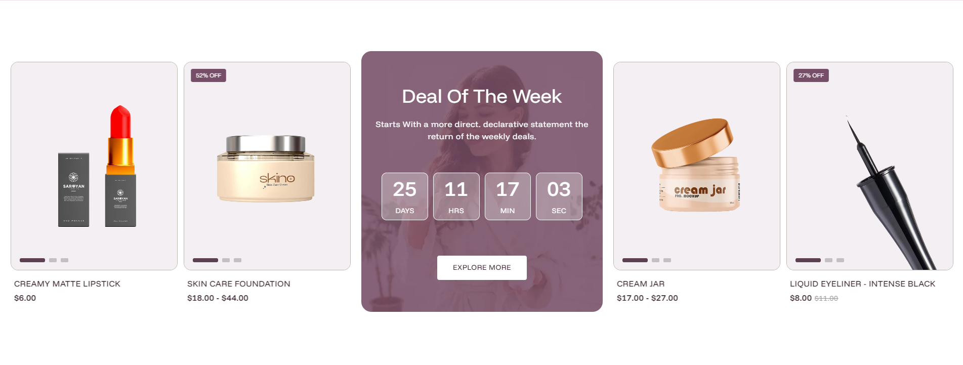
The Countdown timer section in Nexus creates urgency and drives conversions by combining a live countdown clock with a curated product showcase. A customizable background image with an overlay sits at the center, displaying the heading, description, and countdown digits (days, hours, minutes, seconds), while selected products scroll as cards on either side. This layout is ideal for "Deal of the Week" promotions, flash sales, or product launch events.
General Settings
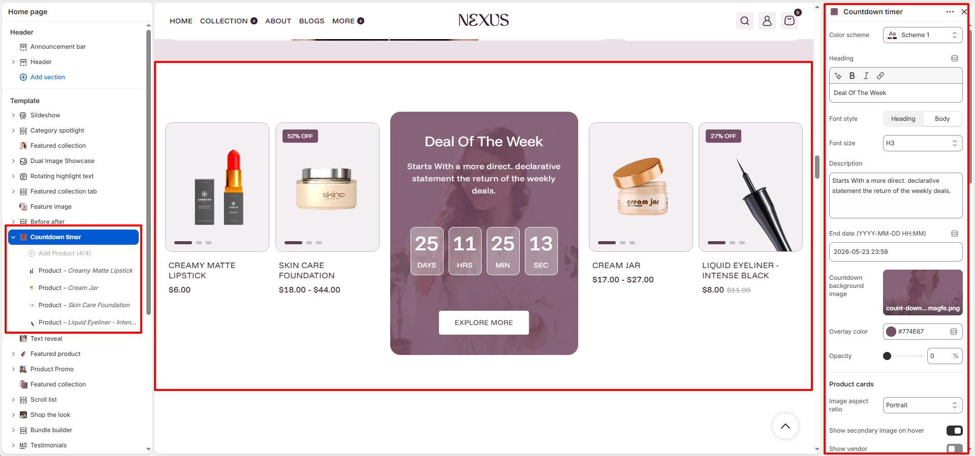
- Color scheme: Select a color scheme (e.g., Scheme 1) to define the base background and text colors for the entire Countdown timer section.
- Countdown position: Choose whether the countdown content appears on the Left, Center, or Right side of the section.
Countdown Content Settings
- Heading: Enter the promotional title displayed in the center countdown block (e.g., "Deal Of The Week"). Use the rich text editor to apply bold or italic formatting to any part of the heading.
- Font style: Choose whether the heading uses the theme's Heading font or the Body font style.
- Font size: Set the HTML heading level for the title text. Options include H1, H2, H3, H4, and H5 (default: H3).
- Description: Add a supporting line of text below the heading to describe the deal or promotion (e.g., "Starts With a more direct, declarative statement the return of the weekly deals.").
- End date (YYYY-MM-DD HH:MM): Set the exact date and time when the countdown should reach zero (e.g., 2026-05-23 23:59). The timer counts down live in real time to this deadline, showing days, hours, minutes, and seconds.
Countdown Background Settings
- Countdown background image: Upload a background image displayed behind the countdown timer in the center block. This creates a rich, branded visual backdrop for the deal content.
- Overlay color: Set a color overlaid on top of the background image to improve text legibility (e.g., #774F67 for a deep plum tone). The overlay blends the image with your brand palette.
- Opacity: Control how transparent or opaque the overlay color is over the background image (e.g., 0% = fully transparent showing the image fully; higher values add more color overlay).
Product Card Settings
- Image aspect ratio: Set the shape of product images on each card. Options include Portrait (tall), Square, Landscape, and Adapt (uses the image's natural dimensions). Default: Portrait.
- Show secondary image on hover: Toggle on to display an alternate product image when a shopper hovers over a product card, providing a quick additional view without extra clicks.
- Show vendor: Toggle on to display the product vendor/brand name on each product card.
- Enable quick view: Toggle on to allow customers to open a quick-view popup with product details and an add-to-cart option directly from the product grid, without navigating away.
- Show image background: Toggle on to display a solid color background area behind each product image within the card.
- Image background color: When "Show image background" is enabled, set the background color applied behind product images (e.g., #F4EFF3 for a soft blush tone).
Text Color Settings
- Text color: Set the color of text displayed inside the countdown center block (e.g., #FFFFFF for white text over a dark background image).
- Enable text card color: Toggle on to apply custom colors to the product card's add-to-cart button elements.
- Background: Set the default background color of the add-to-cart button on product cards.
- Label: Set the text/icon color of the add-to-cart button in its default state.
- Hover background: Set the background color of the add-to-cart button when a shopper hovers over it (e.g., #774F67).
- Hover Label: Set the text/icon color of the add-to-cart button on hover (e.g., #FFFFFF).
CTA Button Settings
- Button label: Enter the text on the call-to-action button displayed inside the countdown block (e.g., "EXPLORE MORE").
- Button link: Choose the destination page, collection, or product the button links to (e.g., All Products).
- Open link in new tab: Toggle on to open the button link in a new browser tab. Toggle off to navigate within the same tab.
- Background: Set the default background color of the CTA button (e.g., #FFFFFF).
- Label: Set the text color of the CTA button in its default state.
- Borders: Set the border color of the CTA button (e.g., #FFFFFF).
- Hover background: Set the background color of the CTA button when hovered.
- Hover Label: Set the text color of the CTA button on hover (e.g., #FFFFFF).
- Hover borders: Set the border color of the CTA button on hover.
Spacing Settings
- Desktop padding top: Set the space above the section on desktop screens (e.g., 80 px).
- Desktop padding bottom: Set the space below the section on desktop screens (e.g., 40 px).
- Mobile padding top: Set the space above the section on mobile screens (e.g., 40 px).
- Mobile padding bottom: Set the space below the section on mobile screens (e.g., 40 px).
Product Block Settings
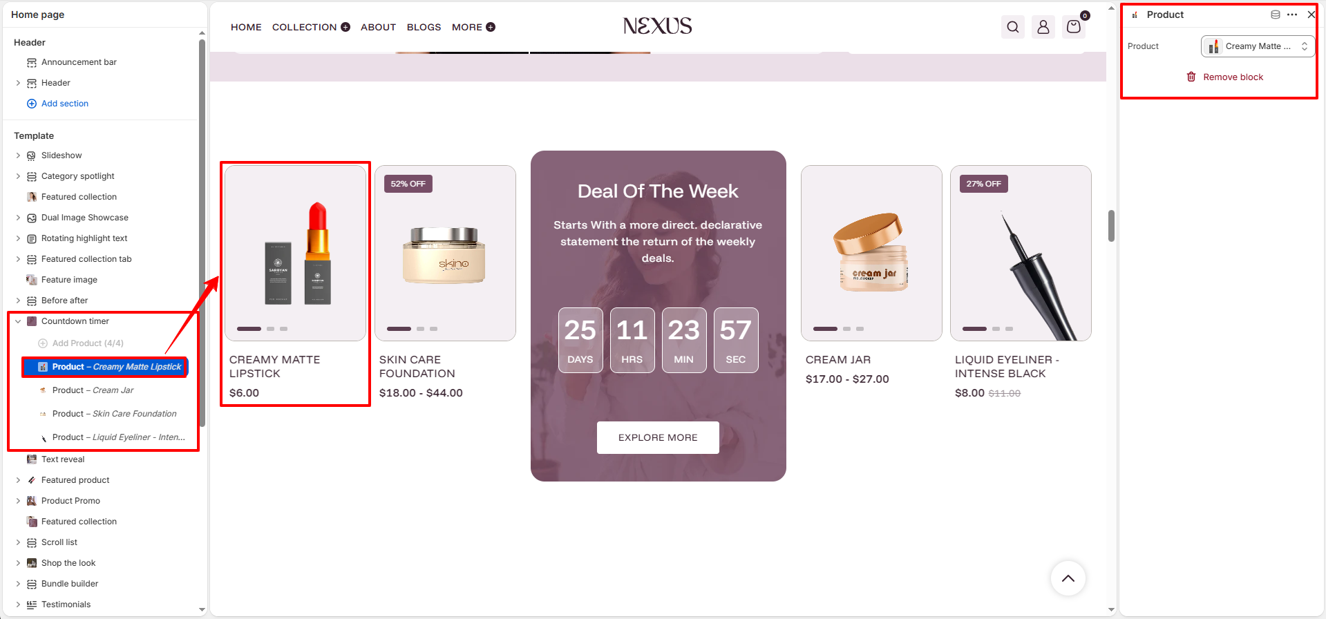
Each Product block added within this section defines one product card displayed in the horizontal scroll area alongside the countdown timer. Add up to 4 Product blocks using the Add Product button. You can add, remove, or reorder blocks as needed.
- Product: Select a Shopify product to display as a card in the countdown deal section (e.g., Creamy Matte Lipstick, Cream Jar, Skin Care Foundation, Liquid Eyeliner – Intense Black). The selected product's image, title, and price are shown on the card, with sale badges (e.g., "52% OFF", "27% OFF") applied automatically if the product has a compare-at price set.
How to Set Up the Countdown Timer Section
- Go to Online Store → Themes → Customize.
- On the Home page template, click Countdown timer in the left sidebar, or click Add section → Countdown timer to add it.
- Choose a Color scheme, enter a Heading and Description, and set the End date for the countdown.
- Upload a Countdown background image and configure the Overlay color and Opacity.
- Configure the Product card settings: aspect ratio, hover image, vendor, quick view, and image background color.
- Set the Button label, Button link, and customize button colors for default and hover states.
- Click Add Product to add product blocks. Select a product for each block (e.g., Creamy Matte Lipstick, Cream Jar).
- Adjust desktop and mobile padding as needed, then click Save.
Pro Tips:
Use a bold, attention-grabbing heading like "Deal of the Week" and keep the
description to one short sentence to maximize visual impact.
Set your countdown end date strategically — short countdowns (3–7 days) create
stronger urgency than longer ones.
Select products that are already on sale (with a compare-at price) so the "% OFF"
badge appears automatically on product cards.
Use a high-contrast overlay color over your background image to keep the heading
and countdown digits clearly readable on all devices.