Feature Image Section – Nexus
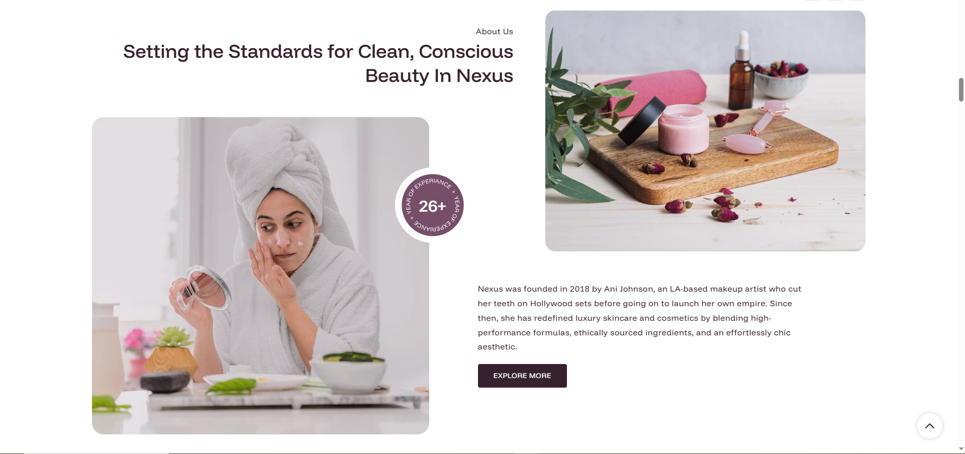
The Feature image section in Nexus is a rich, split-layout content banner designed to showcase your brand story, a campaign message, or an "About Us" statement alongside two high-quality images. It combines text, imagery, a decorative badge, and a call-to-action button into one elegant, fully customizable block — perfect for adding personality and visual depth to your homepage or any page.
General Settings
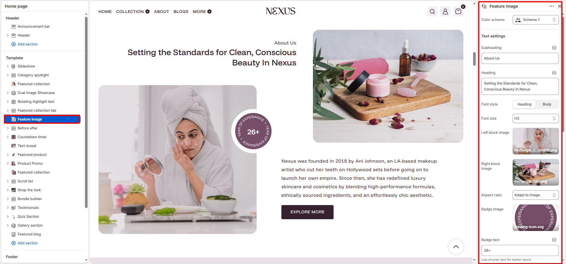
- Color scheme: Select a color scheme (e.g., Scheme 1) to set the background and text colors for the entire Feature Image section.
Text Settings
- Subheading: Enter a short introductory label that appears above the main heading (e.g., "About Us"). This is typically displayed in a smaller, lighter style to set context before the primary title.
- Heading: Enter the main title for the section (e.g., "Setting the Standards for Clean, Conscious Beauty In Nexus"). Use the rich text editor to apply bold or italic formatting.
- Font style: Choose whether the heading follows the theme's Heading font or the Body font style.
- Font size: Set the HTML heading level for the section title. Options include H1, H2, H3, H4, and H5 (default: H3).
Image Settings
- Left block image: Upload the primary image displayed on the left side of the section. This is typically a large lifestyle or model shot that fills the left panel of the split layout.
- Right block image: Upload a complementary image displayed on the right side, creating a balanced visual pairing with the left image (e.g., a product flatlay or close-up shot).
- Aspect ratio: Control how the images are cropped and displayed. Options include fixed ratios (Square, Portrait, Landscape) or Adapt to image to use the image's natural proportions without cropping.
Badge Settings
- Badge image: Upload a circular or stamp-style decorative image that appears as a floating badge overlay on the section (e.g., a "26+ Years of Experience" circular graphic). This adds a trust signal or brand highlight without cluttering the layout.
- Badge text: Enter the short text displayed inside or alongside the badge (e.g., "26+"). The theme recommends using shorter text for the best visual fit within the badge shape.
Body Text & Button Settings
- Text: Add the main body content for the section using the rich text editor. Use this field to tell your brand story, share a campaign message, or provide contextual details (e.g., a paragraph about your brand's founding, mission, and values).
- Button label: Enter the text displayed on the call-to-action button (e.g., "EXPLORE MORE").
- Button link: Link the button to any page, collection, product, or external URL (e.g., the About page). When clicked, shoppers are taken to this destination.
- Button style: Choose the visual style for the button. Options are Primary (solid/filled) or Secondary (outlined/ghost).
- Open link in new tab: Toggle on to open the button destination in a new browser tab instead of navigating away from the current page.
Spacing Settings
- Desktop padding top: Set the space above the section on desktop screens (e.g., 40 px).
- Desktop padding bottom: Set the space below the section on desktop screens (e.g., 40 px).
- Mobile padding top: Set the space above the section on mobile screens (e.g., 0 px).
- Mobile padding bottom: Set the space below the section on mobile screens (e.g., 40 px).
How to Set Up the Feature Image Section
- Go to Online Store → Themes → Customize.
- On your page template, click Feature image in the left sidebar, or click Add section → Feature image to add it.
- Choose a Color scheme and fill in the Subheading and Heading fields.
- Upload your Left block image and Right block image, then select an Aspect ratio.
- Optionally upload a Badge image and enter Badge text.
- Add your brand story or description in the Text field, then configure the button label, link, and style.
- Adjust desktop and mobile padding as needed, then click Save.
Pro Tips:
Use contrasting left and right images to create visual balance and draw the viewer's eye
across the section.
Keep your heading short and impactful — pair it with a concise subheading for a polished,
editorial feel.
Use the badge to highlight a trust signal or brand milestone (e.g., "26+ Years", "100%
Natural", "Award Winning").
Choose images with similar lighting and color tones to maintain a cohesive, premium beauty
aesthetic.