Featured Collection Section – Nexus
The Featured Collection section in Nexus lets you highlight a specific product collection on your homepage or any page. It is perfect for showcasing new arrivals, seasonal products, or best sellers with rich customization over layout, product cards, colors, and spacing.
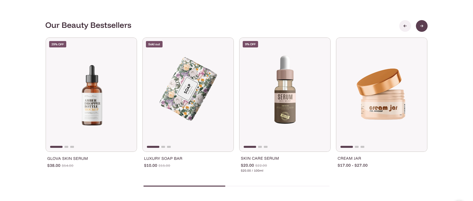
General Settings
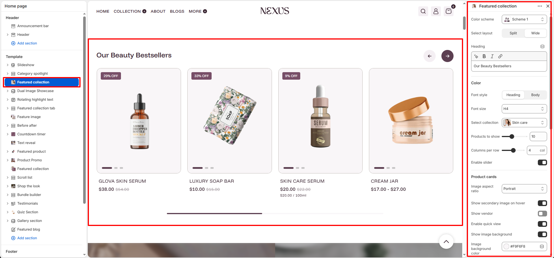
- Color scheme: Select a color scheme (e.g., Scheme 1) to set the background and text colors for the entire Featured Collection section.
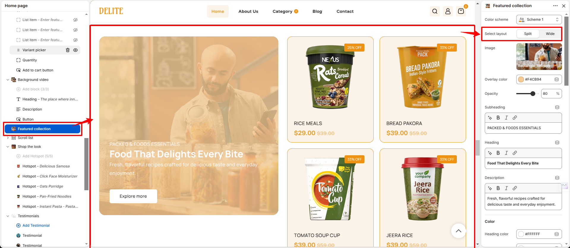
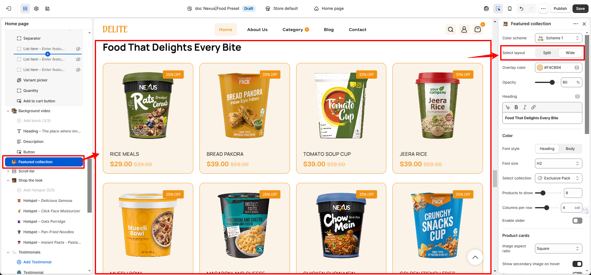
- Select layout: Choose how the section content is arranged:
- Split — Places the heading/title beside the product grid in a two-column layout.
- Wide — Displays the section at full width with the heading above the product grid.
-
Heading: Enter the section title displayed above the product grid (e.g., “Food That Delights Every Bite”).
- Color: Select the text color used for the heading.
- Font style: Choose whether the heading text follows the theme's Heading font or the Body font style.
- Font size: Set the HTML heading level for the section title. Options include H1, H2, H3, H4, H5, and H6.
- Overlay color: Select the overlay color displayed behind the collection content area. This helps improve text visibility and creates a stronger visual hierarchy.
- Opacity: Adjust the transparency level of the overlay color. Higher values create a stronger overlay effect, while lower values allow more of the background to show through.
Collection & Products Settings
- Select collection: Choose which Shopify collection to display in this section (e.g., Skin care). All products are pulled directly from the selected collection.
- Products to show: Set the total number of products to display from the selected collection (e.g., 10). Use the slider to adjust the count.
- Columns per row: Set how many product cards appear side-by-side in each row on desktop (e.g., 4 columns). Use the slider to adjust.
- Enable slider: Toggle on to display products in a horizontal carousel instead of a static grid. When enabled, customers scroll through products left and right using navigation arrows.
Product Card Settings
- Image aspect ratio: Control the shape of product images on each card. Options include Portrait (tall), Square, Landscape (wide), and Adapt (uses the image’s original dimensions).
- Show secondary image on hover: Toggle on to display an alternate product image when a shopper hovers over the card, providing a quick additional view without any extra clicks.
- Show vendor: Toggle on to display the product vendor/brand name below the product title on each card.
- Enable quick view: Toggle on to allow customers to open a quick-view popup with product details and an add-to-cart option directly from the grid, without navigating away from the page.
- Show image background: Toggle on to display a solid colored background area behind each product image within the card.
- Image background color: When “Show image background” is enabled, set the background color applied behind product images (e.g., #F9F6F8 for a soft blush tone).
Add to Cart Color Settings
- Enable add to cart color: Toggle on to apply fully custom colors to the add-to-cart button displayed on each product card.
- Background: Set the default background color of the add-to-cart button (e.g., #DCC5D8 for a muted mauve).
- Label: Set the text/icon color of the add-to-cart button in its default state (e.g., #38212F for a dark plum).
- Hover background: Set the background color of the add-to-cart button when a customer hovers their cursor over it, creating a visual interaction cue.
- Hover Label: Set the text/icon color of the add-to-cart button on hover (e.g., #FFFFFF for white text on a darker hover background).
View All Button
- Enable view all button: Toggle on to show a button below the product grid that links directly to the full collection page.
- Button label: Customize the text displayed on the button (e.g., “View More”). If left empty, a default label is used.
Mobile Layout
- Number of columns: Set how many product card columns appear on mobile screens. The One half option displays two products side by side (2 columns) on mobile for a compact, thumb-friendly browsing layout.
Spacing Settings
- Desktop padding top: Set the space above the section on desktop screens (e.g., 100 px).
- Desktop padding bottom: Set the space below the section on desktop screens (e.g., 40 px).
- Mobile padding top: Set the space above the section on mobile screens (e.g., 40 px).
- Mobile padding bottom: Set the space below the section on mobile screens (e.g., 0 px).
How to Set Up the Featured Collection Section
- Go to Online Store → Themes → Customize.
- On the Home page template, click Featured collection in the left sidebar, or click Add section → Featured collection to add it.
- Select your collection and configure the heading, layout, product count, columns per row, card styling, and spacing.
- Optionally enable the slider, quick view, and “View All” button.
- Click Save to apply your changes.
Pro Tips:
Use high-quality product images with consistent aspect ratios for a polished look.
Highlight best-selling or seasonal products to drive conversions.
Enable the slider when showing more than 4 products to keep the layout clean on desktop.
Turn on “Show secondary image on hover” to give shoppers a richer browsing experience without
extra clicks.