Featured Product – Nexus
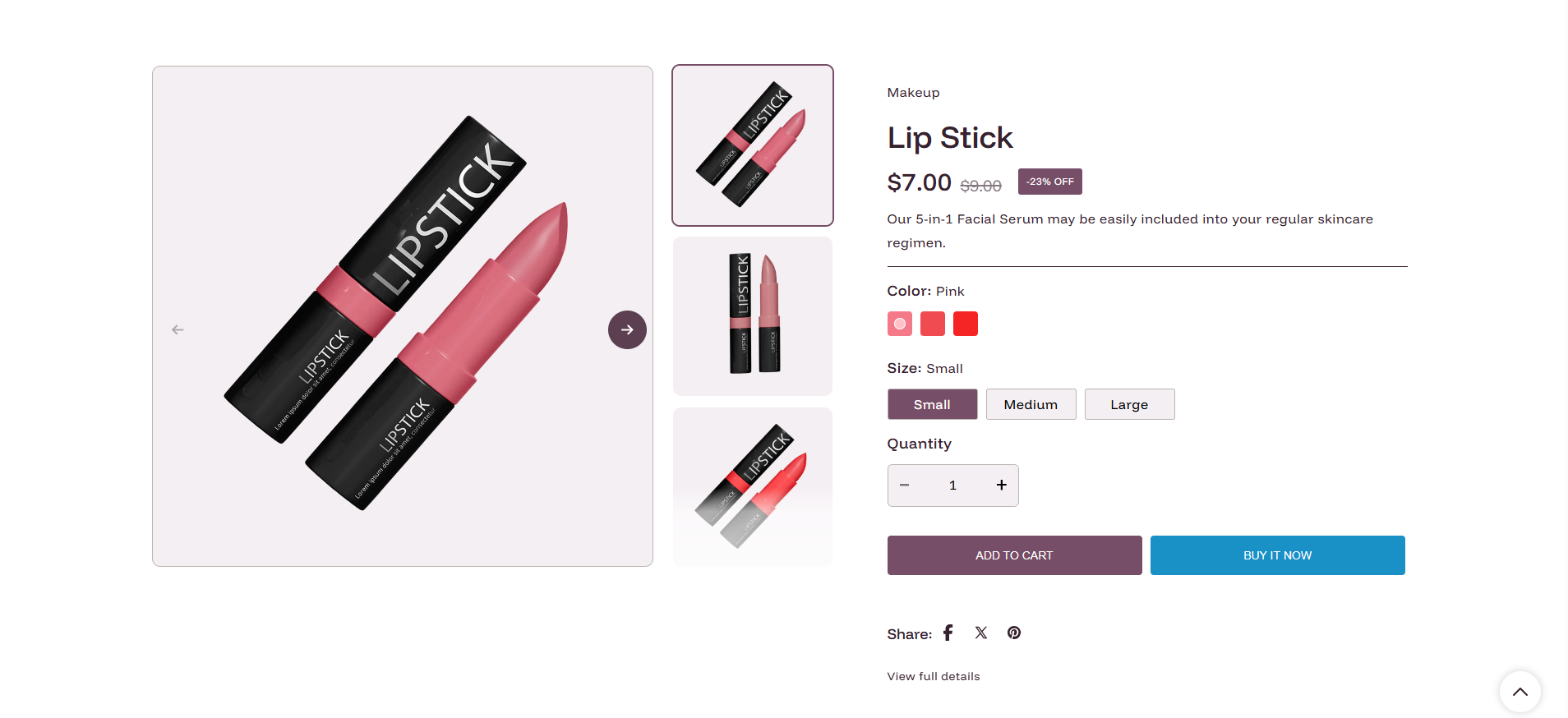
The Featured Product section allows you to highlight a specific product directly on your homepage or any other page, providing a streamlined shopping experience without requiring customers to navigate away.
This section inherits the premium design of the main product page but is optimized for high conversion in a modular layout.
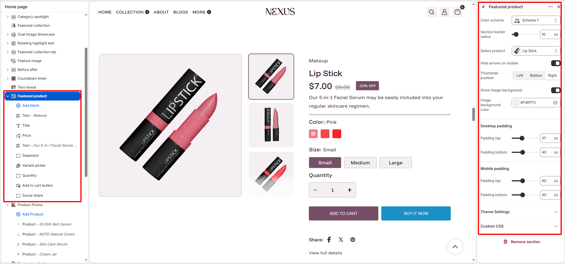
Featured Product Section Settings:
Customize the layout and behavior of your featured product section with these intuitive settings:
- Color Scheme: Select the overall background and text color for the section (e.g., Scheme 1).
- Section border radius: Use the slider to adjust the rounded corners of the section (0px to 100px).
- Select product: Choose the specific product you want to feature from your catalog.
- Thumbnail position: Place thumbnails on the Left, Bottom, or Right of the main product image.
-
Media Features:
- Hide arrows on mobile: Toggle this to remove navigation arrows from the mobile image slider.
- Show image background: Toggle this to add a subtle background color behind the product image.
- Image background color: Choose a custom hex color for the image background area.
-
Section Padding:
- Desktop padding: Adjust the vertical spacing (Top/Bottom) for desktop views.
- Mobile padding: Adjust the vertical spacing (Top/Bottom) for mobile views.
- Theme Settings: Access global settings for typography, colors, and buttons that affect the entire section.
Featured Product Content Blocks:
The Featured Product section is built using flexible content blocks. You can add, remove, and reorder these blocks to create a layout that highlights your product's best features. Below are the available unique blocks:
- Vendor: Displays the brand name. No specific settings.
-
Title: Shows the product name with automatic SEO formatting.
- Font style: Choose whether the title uses the theme's Heading font or Body font style.
- Font size: Select the heading size for the product title. Available options range from H1 to H5.
- Price: Displays current and compare-at prices.
- Text: A flexible block for custom text or taglines.
- Separator: Adds a visual divider line.
-
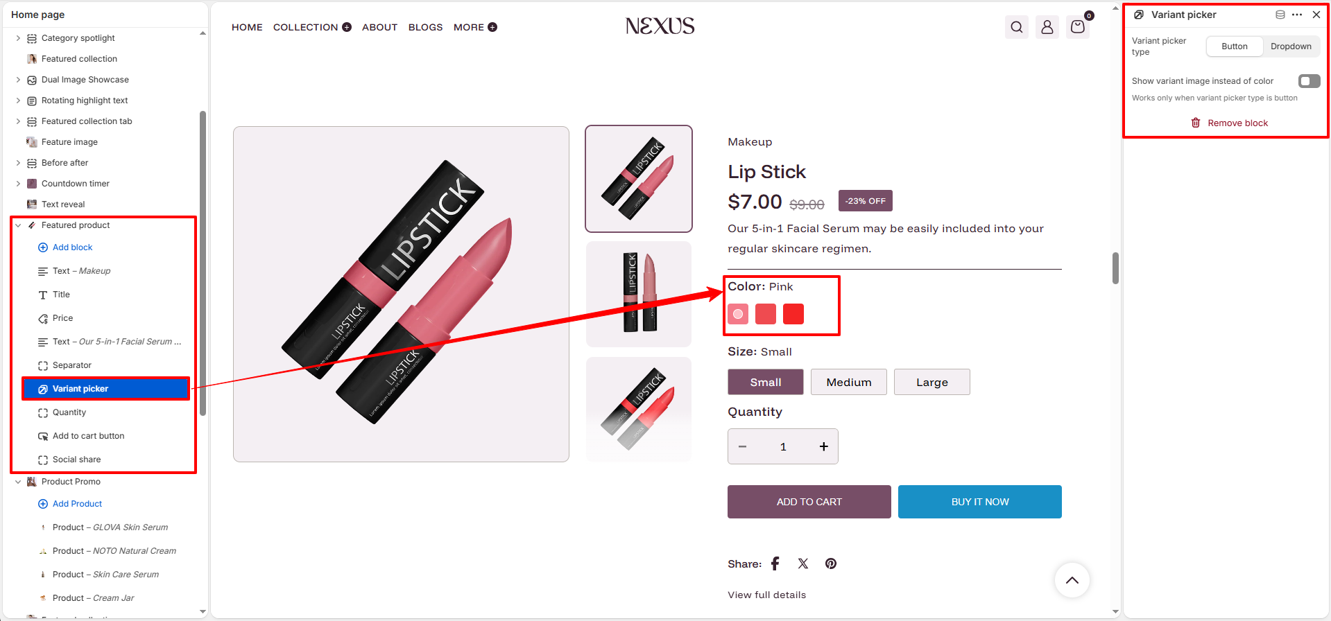
Variant Picker:
- Picker type: Choose between Button (swatches) or Dropdown.
- Show variant image instead of color:Enable this to display the variant's actual image as the selection swatch.
- Quantity: Provides a numeric selector for customers.
-
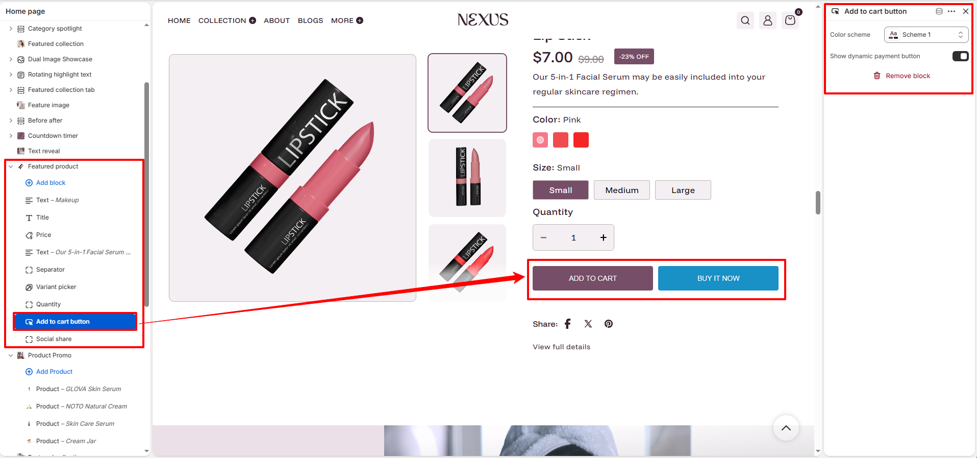
Add to cart button:
- Color scheme: Select a specific color theme for the button.
- Show dynamic payment button: Enable "Buy it Now" for accelerated checkouts.
-
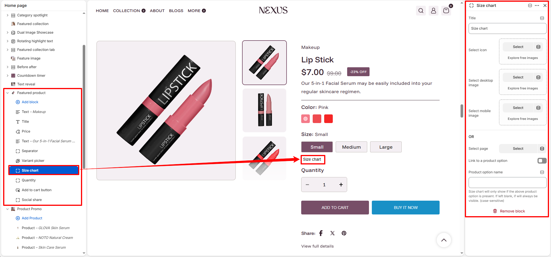
Size chart:
- Select desktop/mobile image:Upload dedicated guide images for different screen sizes.
- Choose Icon: Select an icon to appear next to the link.
- Select Page: Link to a dedicated Shopify page instead of an image.
- Description: Displays the full product description from Admin.
- SKU: Displays the Stock Keeping Unit for the selected variant.
-
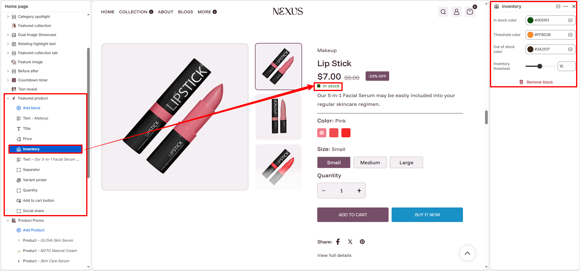
Inventory:
- In stock color: Select a custom color for the "In stock" status indicator (e.g., #005101).
- Threshold color: Select a custom color for the "Low stock" status indicator (e.g., #FF8D2B).
- Out of stock color: Select a custom color for the "Out of stock" status indicator (e.g., #3A2517).
- Inventory threshold: Use the slider or number input to set the minimum quantity that triggers the low stock status.
-
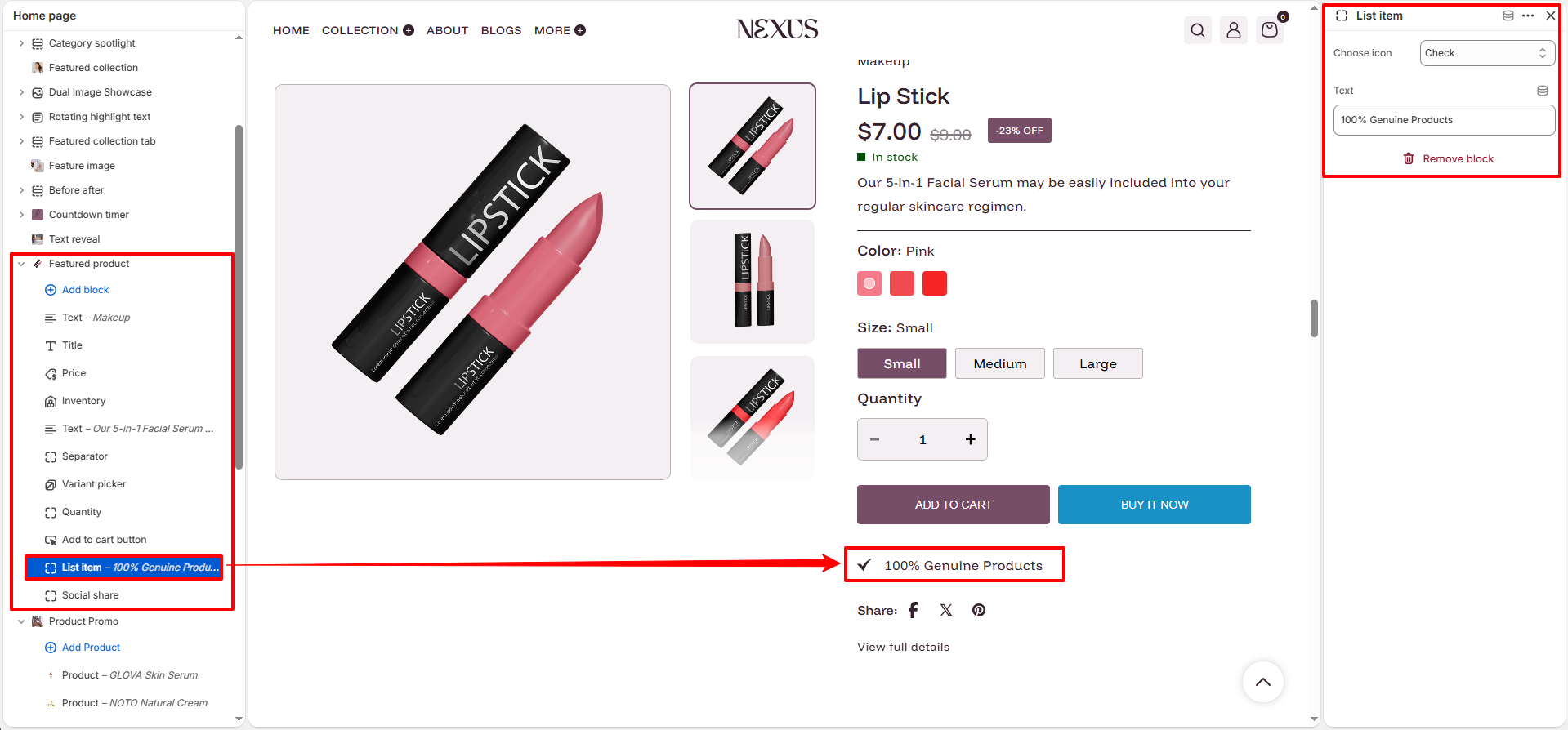
List item:
- Choose Icon: Select from a library of built-in icons (e.g., checkmark, globe).
- Text: Add custom perk text like "Fast Shipping".
-
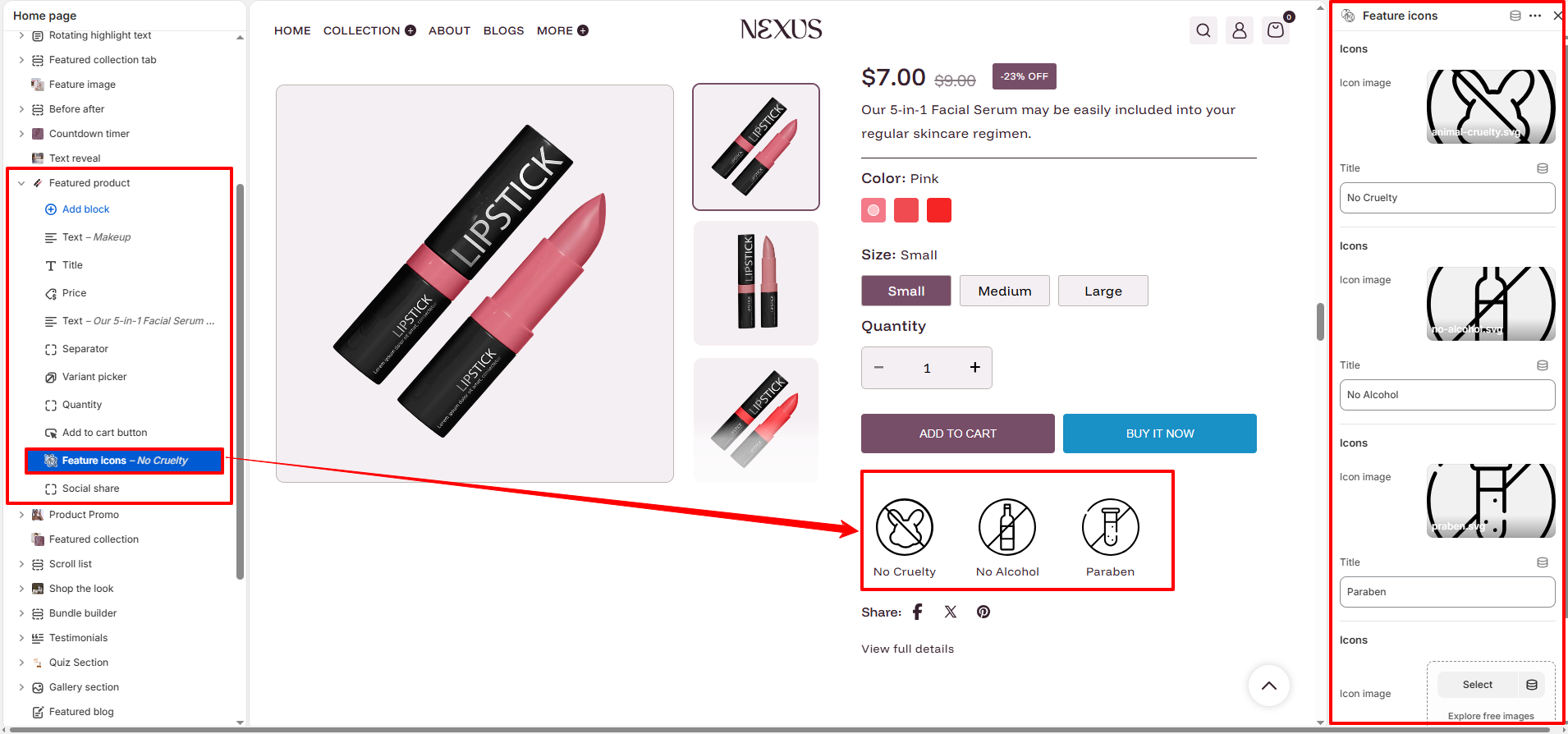
Feature icons:
- Icon image: Upload custom SVG or image files for your brand values.
- Title: Label for the icon (e.g., "Vegan").
-
Collapsible tab:
- Heading: The title of the accordion tab.
- Content: Add text, lists, or links via the rich text editor.
- Default open: Toggle if the tab should be expanded on load.
-
Social share:
- Enable sharing: Toggle icons for Facebook, X, and Pinterest.
How to Setup a Featured Product
- Go to Online Store → Themes → Customize
- Click Add section in the sidebar and select Featured product
- In the section settings, click Select product to pick the item you want to feature
- Rearrange or customize blocks to highlight the most important product details
- Save your changes