Slideshow Section
The Slideshow section in Nexus lets you create a stunning, full-width hero banner with multiple slides, product showcases, and rich customization options. You can configure both the overall section behavior and each individual slide block from the Shopify Theme Editor.
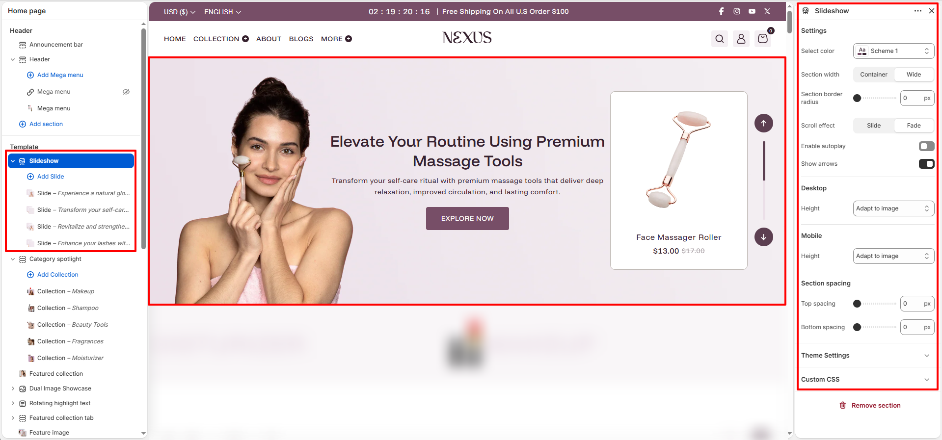
Slideshow Section Settings
- Select color: Choose a color scheme (e.g., Scheme 1) to define the background and text colors for the entire slideshow section.
- Section width: Set whether the slideshow spans the full Container width or goes edge-to-edge as Wide.
- Section border radius: Set a rounded corner value (in px) for the section container (e.g., 0 px for sharp edges).
- Scroll effect: Choose the transition animation between slides — Slide (horizontal swipe) or Fade (cross-dissolve).
- Enable autoplay: Toggle on to automatically advance slides without user interaction.
- Show arrows: Toggle on to display left/right navigation arrows on the slideshow for manual slide control.
Height Settings
- Desktop height: Control the slideshow height on desktop. The Adapt to Image option automatically sizes the slider to match the uploaded image dimensions.
- Mobile height: Control the slideshow height on mobile. Also defaults to Adapt to Image for a natural, responsive look.
Section Spacing
- Top spacing: Set the space above the slideshow section (e.g., 0 px).
- Bottom spacing: Set the space below the slideshow section (e.g., 0 px).
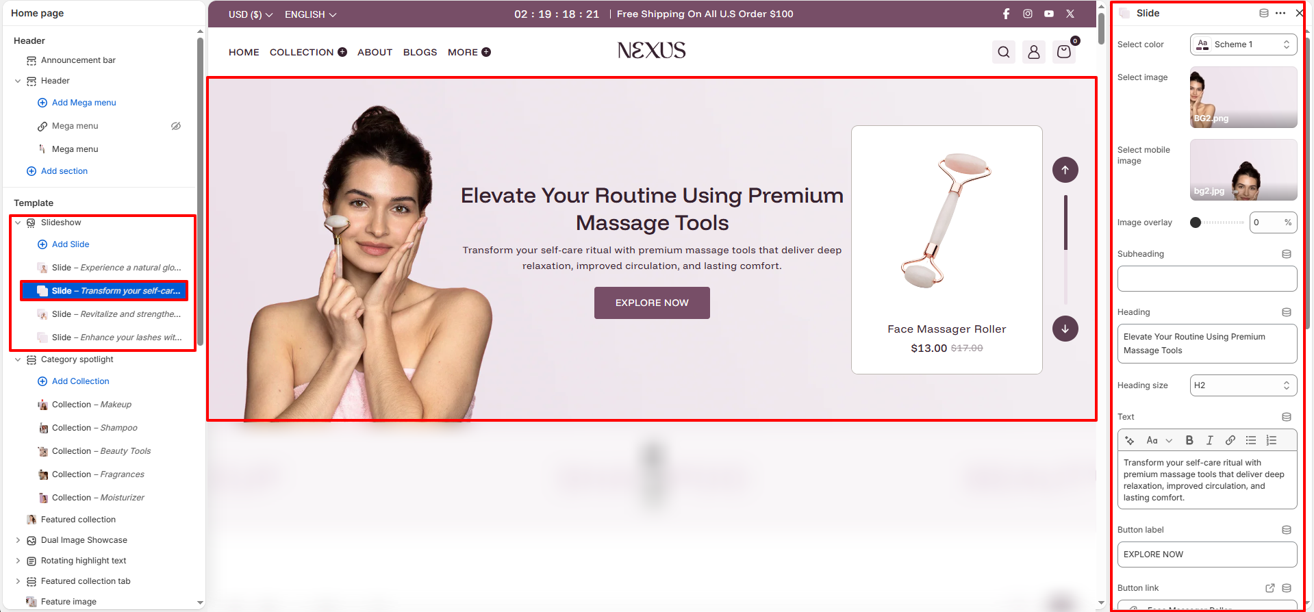
Slide Block Settings
Each individual slide added within the Slideshow section has its own block settings panel:
- Select color: Pick a color scheme (e.g., Scheme 1) for the slide's text and overlay colors.
- Select image: Upload the primary desktop background image for this slide.
- Select mobile image: Upload a separate optimized image to display on mobile devices.
- Image overlay: Apply a dark overlay on top of the slide image to improve text readability. Set a percentage from 0% (no overlay) to 100% (fully dark).
- Subheading: Add a short line of text above the main heading (optional).
- Heading: Enter the main title text for the slide (e.g., "Elevate Your Routine Using Premium Massage Tools").
- Heading size: Set the HTML heading level for the slide title. Options include H1, H2, H3, H4, and H5 (default: H2).
- Text: Add a descriptive paragraph below the heading using the rich text editor with bold, italic, and link formatting options.
- Button label: Enter the text displayed on the call-to-action button (e.g., "EXPLORE NOW").
- Button link: Link the button to a product, collection, page, or any URL (e.g., Face Massager Roller product).
- Button style: Choose between Primary and Secondary button styles.
- Open in new tab: Toggle on to open the button link in a new browser tab.
Product Card Settings
Each slide can optionally display a floating product card on top of the slide image:
- Show product: Toggle on to display a product card overlay on the slide.
- Select product: Choose which product to feature in the card (e.g., Face Massager Roller).
- Product image size: Set the shape of the product image inside the card — options include Square, Portrait, or Landscape.
- Enable card background: Toggle on to display a solid background color behind the product card.
- Background color: Pick the card background color (e.g., #FFFFFF for white).
- Content position: Set the position of the text content inside the card (e.g., Middle center).
- Text alignment: Align text within the product card — Left, Center, or Right.
- Content width: Set the maximum width of the slide's text content area on desktop (e.g., 600 px).
Mobile Settings (per Slide)
- Content position (Mobile): Set the content alignment position on mobile (e.g., Top center).
- Text alignment (Mobile): Control how text aligns inside the slide on mobile — Left, Center, or Right.
- Content width (Mobile): Set the maximum content width on mobile devices (e.g., 850 px).
How to Set Up the Hero Slideshow
- Go to Online Store → Themes → Customize.
- On the Home page template, click on the Slideshow section in the left sidebar.
- Use the right-hand settings panel to configure color scheme, section width, scroll effect, autoplay, arrows, and height.
- Click Add Slide to add individual slide blocks and configure each slide's image, content, button, and product card.
- Click Save to apply your changes.
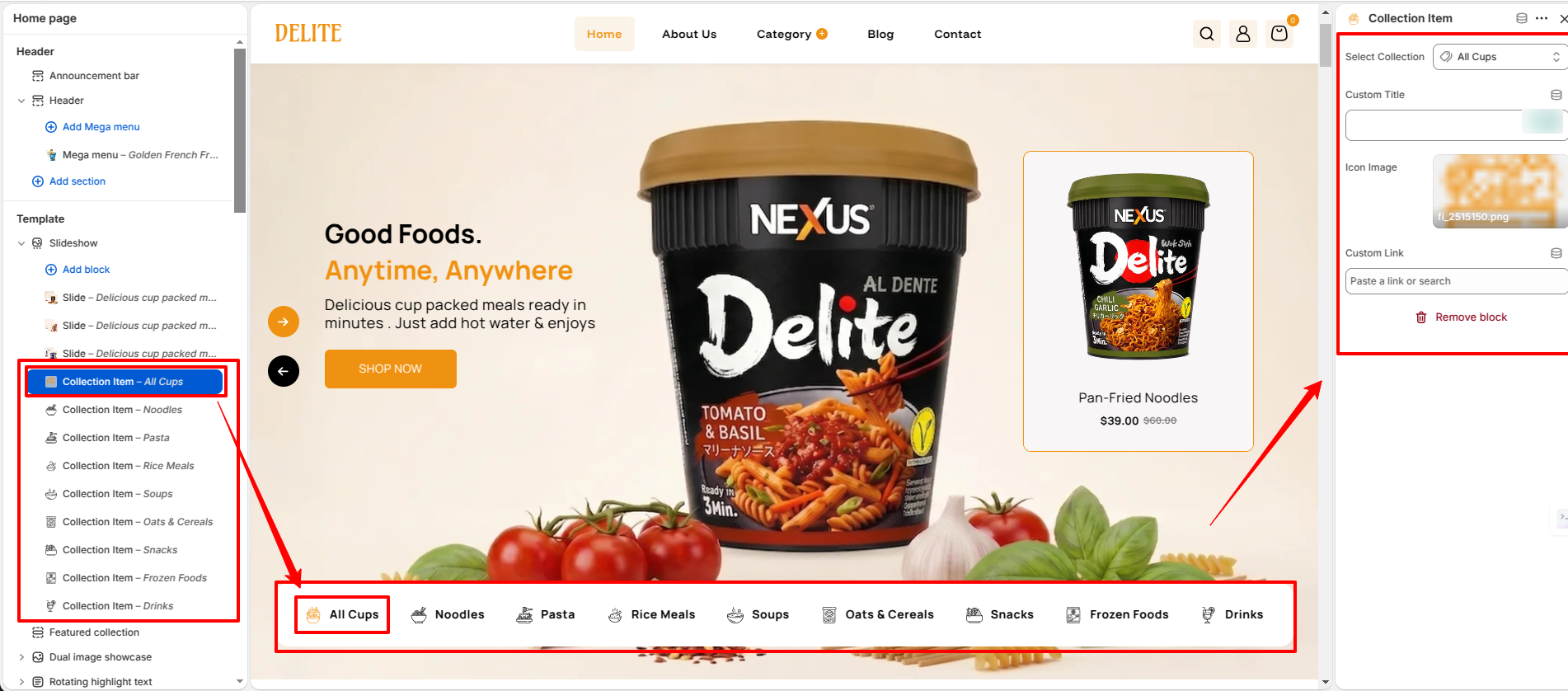
Collection Item Block Settings
In this section, you can configure the settings for each collection item block within the slideshow:
- Select Collection: Pick a Collection (e.g., All Cups) for the collection block.
- Custom Title: Enter a custom title for the collection block.
- Icon Image: Upload a separate optimized icon image to display on the collection block.
- Custom Link: Enter a custom URL for the collection block.
Pro Tips:
Use high-resolution images (at least 1440×700 px) for the best desktop display.
Upload a separate mobile image for each slide to ensure correct cropping on small screens.
Apply a subtle image overlay (10–30%) if your heading text is hard to read over the background
image.