Text With Icon Section – Nexus
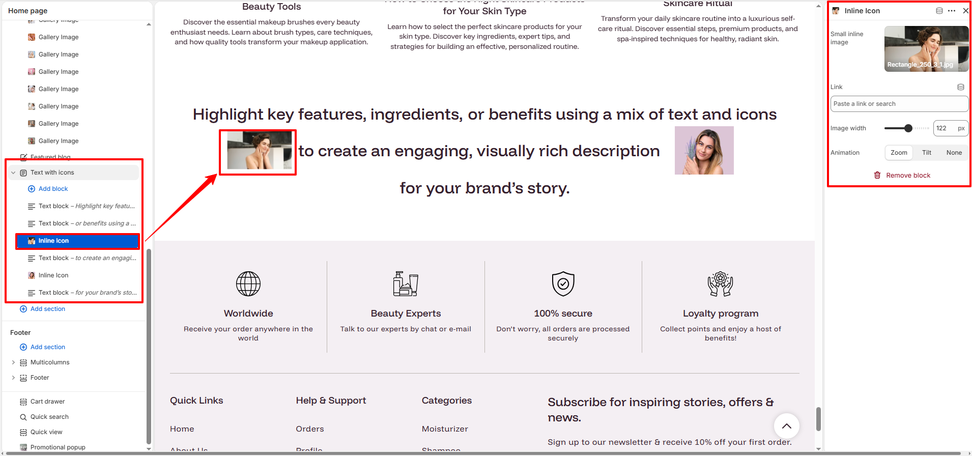
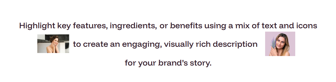
The Text With Icon section allows you to highlight important product features or benefits using concise text paired with small, meaningful icons.This creates a visually engaging presentation that enhances readability and appeal.
It’s ideal for showcasing key ingredients, beauty results, or other essential details in a clean and stylish way—similar to the elegant text-and-icon layout shown in your example.
How to Set Up the Text With Icon Section:
- Navigate to Online Store → Themes → Customize.
- Click Add section and select Text with icons.
- Configure the global Font Style, Size, and Container Width.
- Add Text blocks for phrases and Inline icon blocks for images.
- Rearrange the blocks to form your desired sentence or layout.
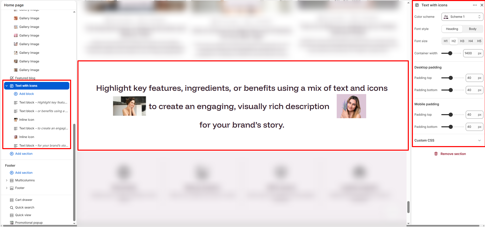
Section Settings:
Customize the global appearance of your text-and-icon layout:
- Color scheme: Select a palette to match your branding (e.g., Scheme 1).
- Font style: Choose between Heading or Body typography.
- Font size: Select the font scale (H1-H5) for the entire block.
- Container width: Adjust the maximum width (e.g., 1400px) of the section.
-
Desktop padding:
- Padding top: Vertical space above the section on desktop.
- Padding bottom: Vertical space below the section on desktop.
-
Mobile padding:
- Padding top: Vertical space above the section on mobile.
- Padding bottom: Vertical space below the section on mobile.
Block Settings:
Configure the individual elements that make up your description:
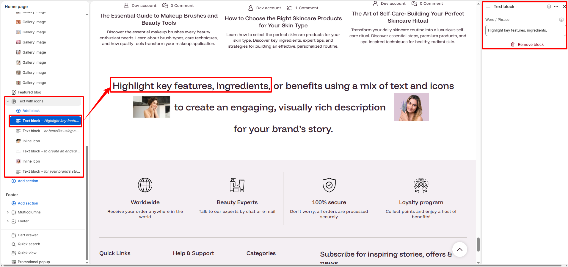
- Text Block:
- Word / Phrase: Enter the text segment for this block.
- Inline Icon Block:
- Small Inline Image: Upload a small image or icon to appear within the text.
- Link: Add a destination URL for the icon.
- Image width: Adjust the size of the inline image (e.g., 122px).
- Animation: Choose an interactive effect: Zoom, Tilt, or None.